This is how I created an onboarding feature for users in meditation app Pausa, with the goal of increasing engagement and a better understanding of what they can get with Pausa. This was part of a larger project, where I also redesigned the sign-up process.

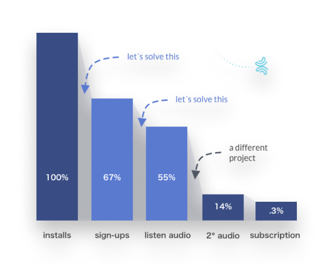
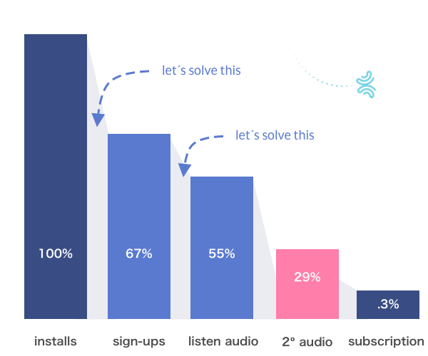
On average, only 67% of the users downloading Pausa end up signing up. Furthermore, only 55% of the users start listening to our beginner´s 7-day meditation program, which we consider key to make them feel happy with Pausa and end up subscribing.
Plus, only 25% of the users who listen to the first audio continue listening to the second audio.
How could we drive more sign-ups and engagement so that they at least try out the meditation app?
I led the design process of building two separate but very linked features:
We believe that, altogether, this would allow users to have a better understanding about what they can expect to get and achieve by using Pausa.
What follows is how we created the onboarding process. If you want to see how we redesigned the sign-up flow, click here.
We decided to invest time to research and have a better understanding about what we should be working on. On one hand, we analyzed the competition. On the other, we surveyed our users.
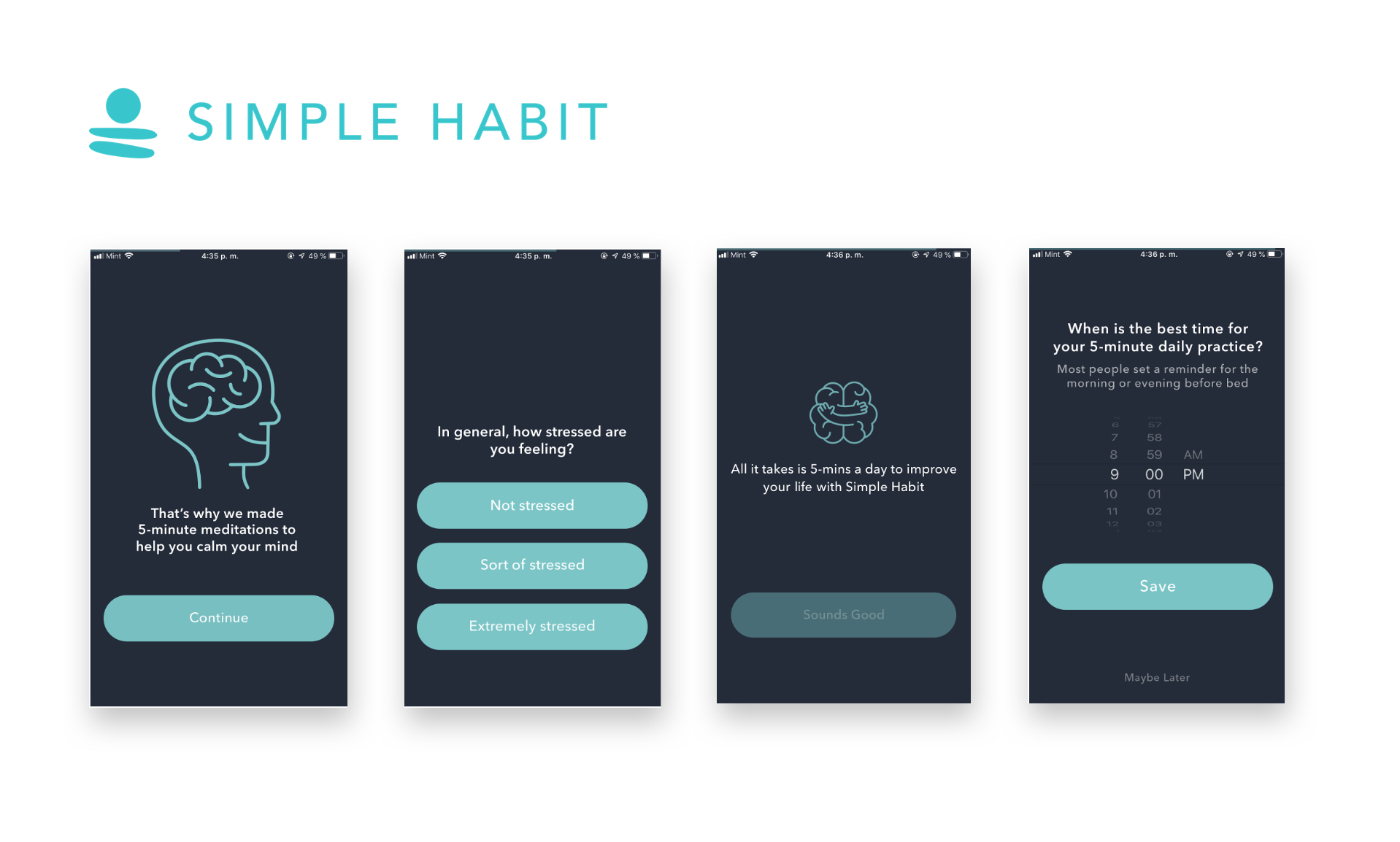
To start with, a member of the team carried out a competitive analysis focusing specifically on how other similar apps (Headspace, Calm, Mind Valley, Simple Habit, etc.) were onboarding their users, both pre and post sign-up. A larger competitive analysis was also conducted as part of our overall redesign strategy (see here).
We found that competitors use different strategies, but two clear patterns stand out: 1) They ask users what they want to achieve; 2) They highlight their value prop right away.
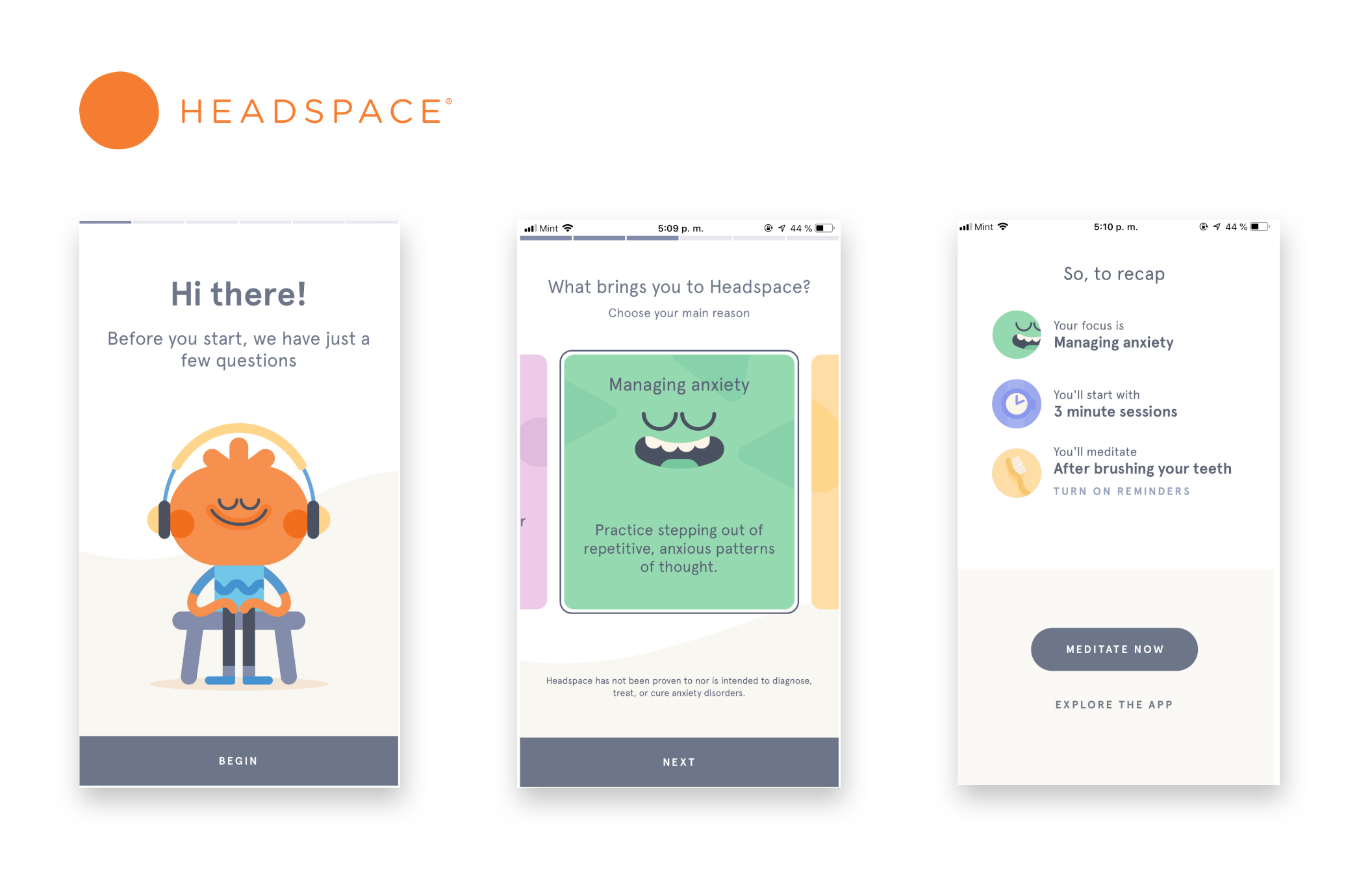
With not so much text and a lot of interactive animation, Headspace asks users what their goals are. A powerful sense of personalization and engagement is given.
Simple Habit focuses on stress, and generates the idea that if users shared what their current status is, then they would help. Again, it´s all about asking users.
This analysis helped us decide to include an “ask the user” feature in our product roadmap. In the short-term, we would start by setting up the correct expectations. How could we better understand what to include? We asked users.
We ran a survey targeting not only our existing Pausa users but also leads and students from our other property AnimaEdu. Our main objectives were to understand:
Unfortunately, some results and insights can´t be disclosed, but a good summary can be found below.
We surveyed very targeted existing and potential users. With this information, we were able to define our user stories, flows and content strategy.

With this feedback coming directly from users, I then invested time defining user stories for the onboarding feature. This, and working on the content strategy, would allow me to start sketching solutions.
Thanks to the competitive analysis and survey conducted, we were able to decide what type of onboarding process we would start with, and what information to consider in our content strategy.
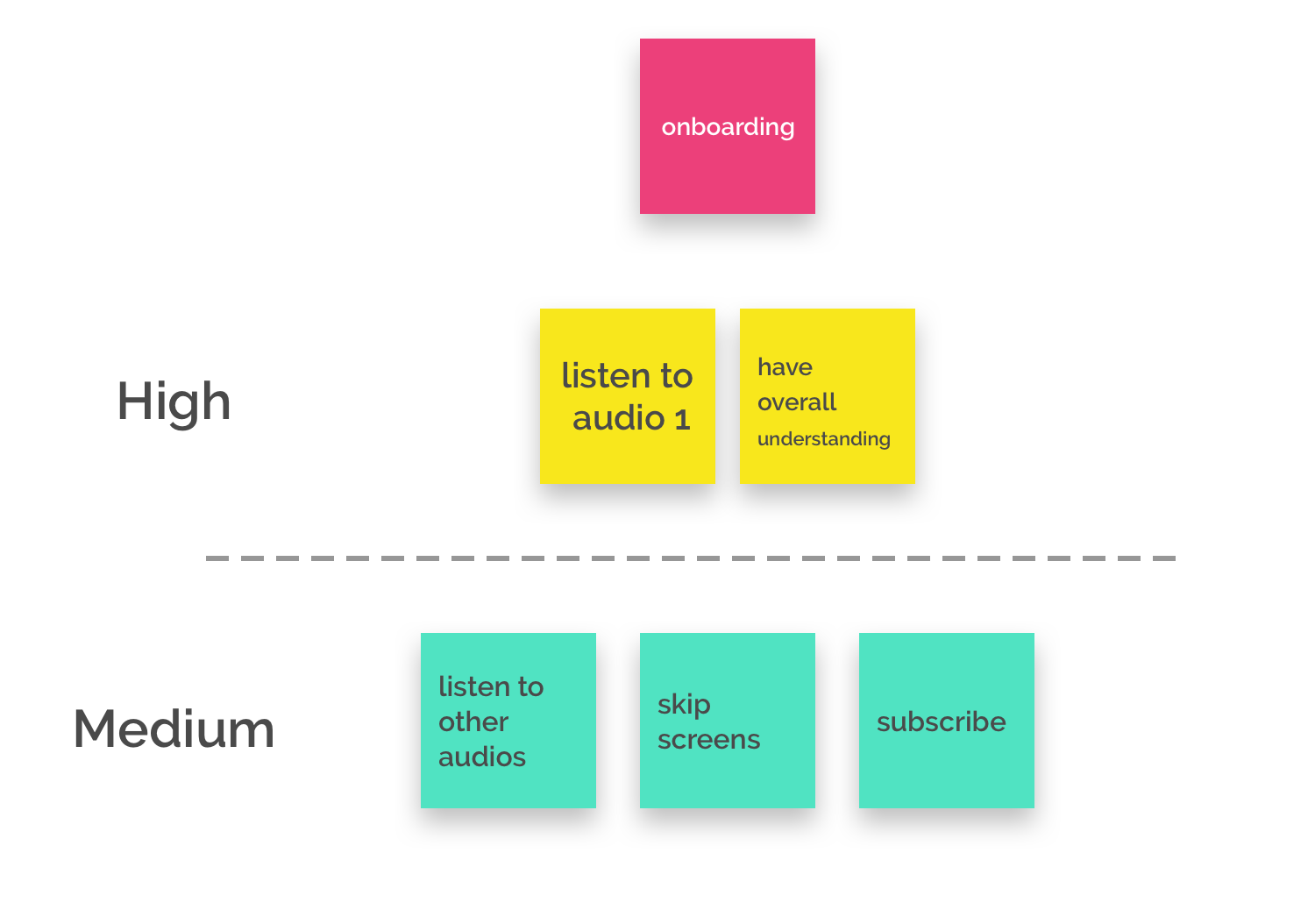
With this in mind, I listed those tasks that users would like to be able to perform. This was pretty straightforward: A bigger challenge was what content to include.
One of our team members took the lead to define what key messages we would be showing to our users, with two main goals in mind: a) To provide them with an overall understanding on how to use Pausa; b) To guide them to what we considered was the best way to start the journey with Pausa: Our 7-day program for beginners.
But even more important than that, we set up our app to be able to AB test between messages, so as to iterate and find the right hook.

Not only we created our first series of messages, but we also deployed a tool to AB test between different content.
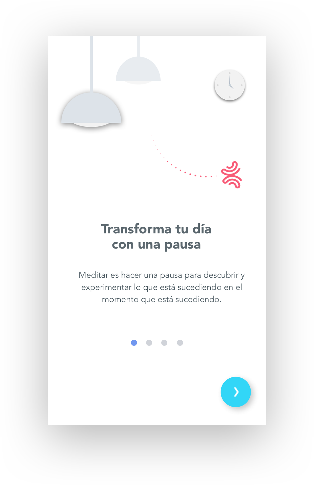
This is the standard structure we came up with. With this, we would start iterating over the content collaboratively.
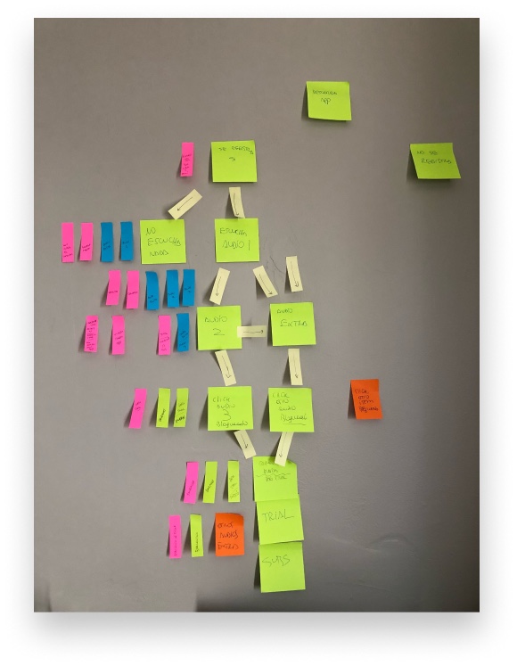
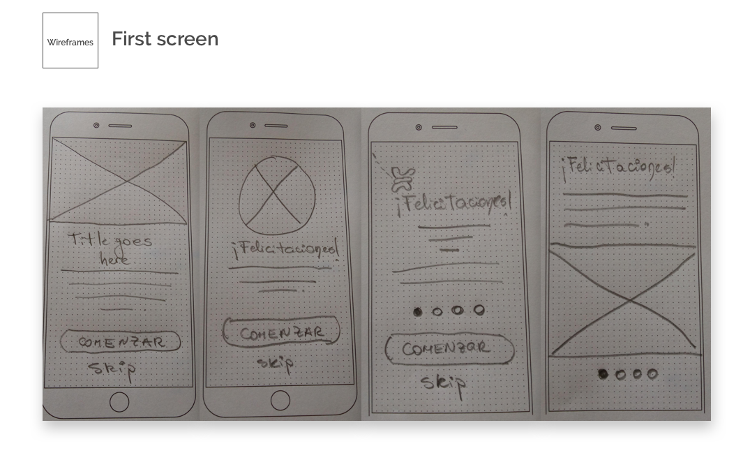
With a general sense of the number of screens that we were planning to use and the content that we would be including, I started sketching different alternatives.
This allowed me to start playing with different variations at a very low cost. Also, it helped me make sure that I was providing and serving all the high-priority tasks.

At this point, I had critical feedback by users, a solid content strategy designed and different sketches I could play with. Now it was time to add some color.
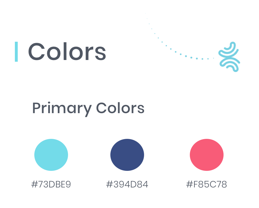
We discussed internally and decided that at this stage we wouldn´t make any major change regarding colors. However, as we were aware of the fact that we would be placing much more text than in other screens, we explored the opportunity to use a white/light background instead of our classic light blue one.
With this in mind, I sketched different versions, experimented with our primary and secondary colors. The main concept regarding the feeling we wanted to convey was calmness, pureness.
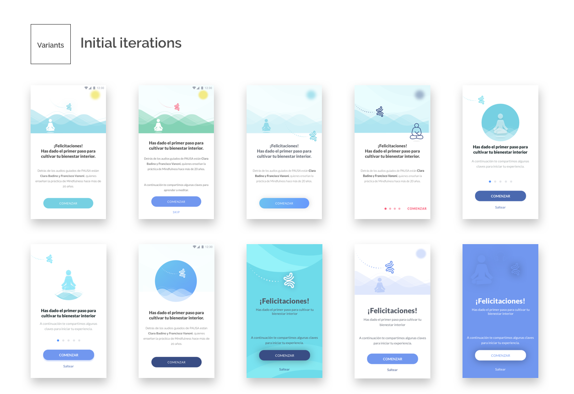
I sent these iterations over to the team, who sent their suggestions and allowed me to land to this preferred “core” design. With this, I would start iterating again.
Once the core design was chosen, it was time to start playing with different variations. It ended up being an iterative process between the content that we were adding and the look and feel. We had key discussions over whether to show a “skip” button, color for CTA, etc.
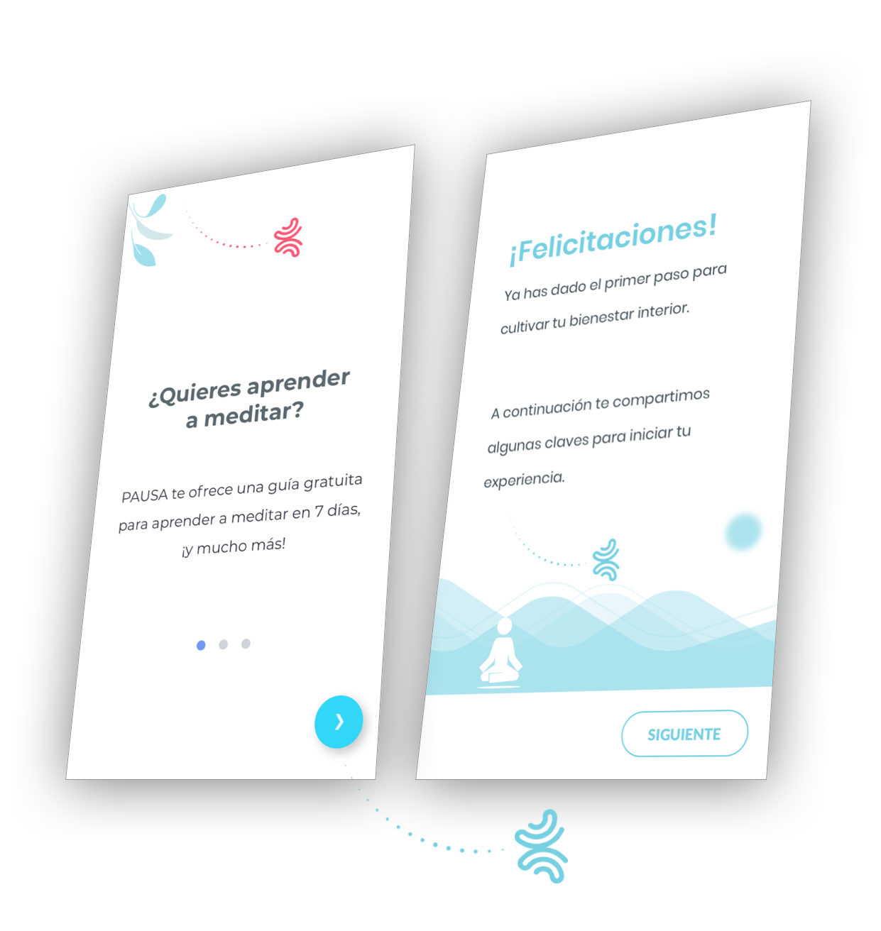
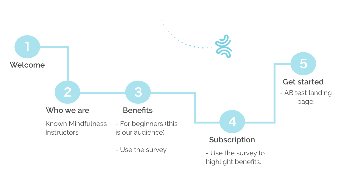
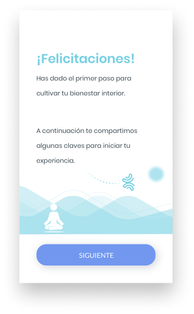
Below you can see how the finalized flows and screens looked like, as well as some iterations made throughout the process.
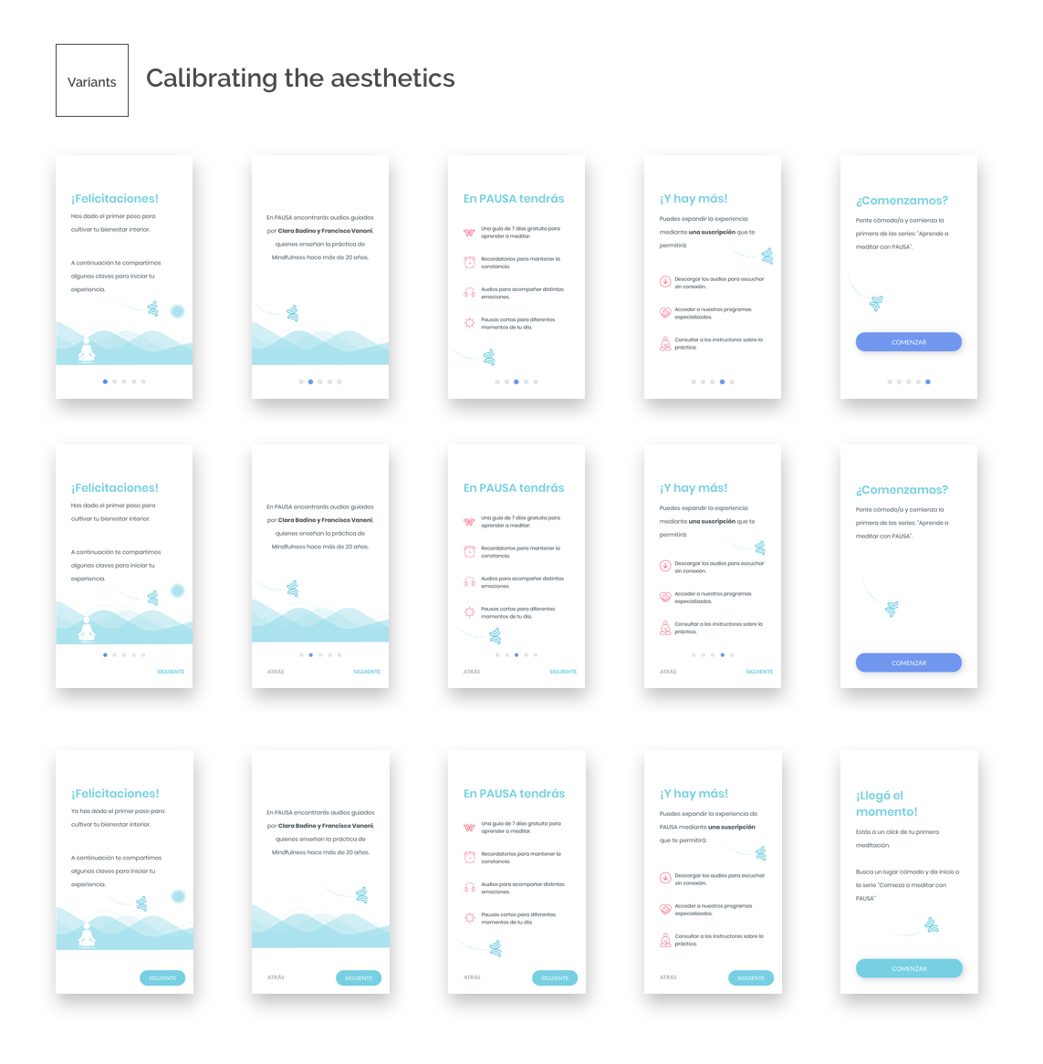
I essentially played with different types of buttons and colors for the CTA. While leaving the sliders with no Next/Back buttons would give us more space, given our not-so-savvy audience we decided to include visible, simple and intuitive buttons.
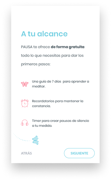
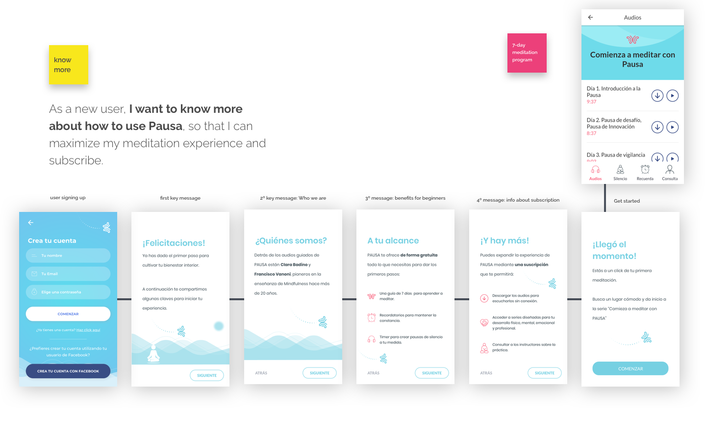
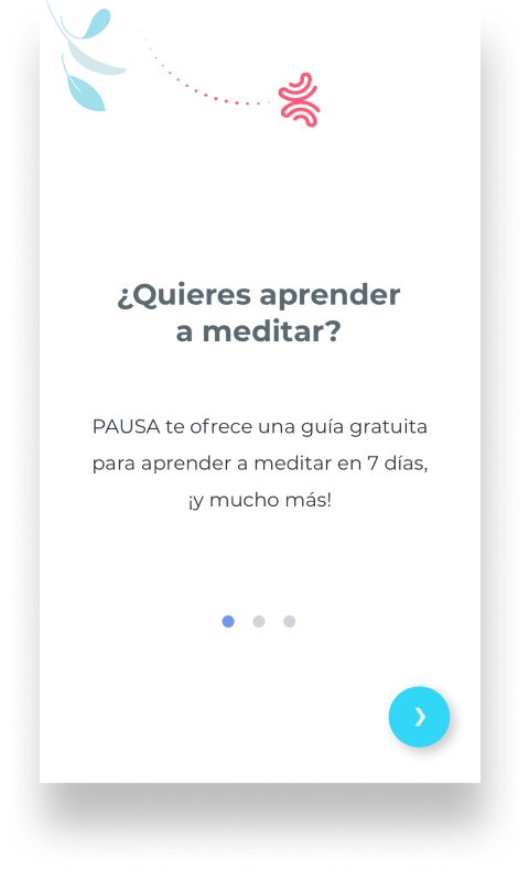
You can see here the complete flow, once a user signs up. They are taken through 5 screens that explain what they will find in Pausa, who the people involved are, and what they would get if they subscribe. After that, they are taken to the "7-day meditation program" screen.
It´s very important to highlight again that we set up the ability to AB test with the text and elements shown in those screens.
While the percentage of users listening to the first audio of our basic meditation program remained the same, two things are worth noticing:
- The number of users listening to the second audio increased dramatically (2x). We believe this was caused mainly by other important initiatives taken (e.g. sending push messages reminding them to start the second day of Pausa), which are tied to the overall strategy of onboarding them appropriately.
- Other users might not start from the first audio of the beginners program. But instead, they would choose more advanced ones.

In these 3 weeks of intense work, we as a team had the opportunity to optimize key areas in Pausa. Not only did we create an onboarding process, but also we set up the machinery to AB test and find the most appealing messaging for our users. There are a few lessons and also a lot more we can and are planning to do: