We wanted to increase the number of courses purchased by students and we had different alternatives for doing so. This is how I prioritized which one to go for, and how I built it.

One of our key metrics in AnimaEdu is how we can increase our cross-sell rate for existing students. We know many of them are genuinely interested in buying more courses, which is something great for everyone: As long as our courses help them discover their inner growth, it is a win-win situation.
Even though we had some ideas to implement longer term (such as developing an all-you-can-eat feature), the big question is: How can we increase the cross-sell rate in students in a 2-week sprint?
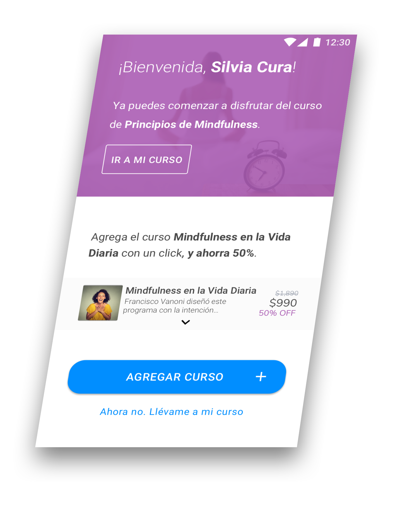
I assessed and designed a cross-sell feature to allow students to buy a second course with a 50% discount. After each course purchase, the students receives the opportunity to buy another course by clicking on the CTA.
This offer currently shows only in the thank you page after assessing risks and feasibility, but with a big opportunity for more complex and risky (yet potentially rewarding) improvements.
The first thing I did was to have a look at how comparable websites were cross-selling courses. That would allow me to get a list of alternatives and analyse feasibility, pros and risks.
Given the problem, I decided to gauge ideas and a better understanding on what other brands are doing to cross-sell courses, mainly from the web.
I analyzed different sites, such as Udemy, Masterclass and Mindful Science. I also analyzed websites selling products instead of services. What was their offering? How were they trying to surface options to increase the number of courses purchased?
Essentially, four main alternatives emerged: the Add to Cart option, an All-You-Can-Eat feature and selling right before or after the initial purchase.
Through the competive analysis, four main alternatives emerged: an Add to Cart option, an All-You-Can-Eat feature and selling right before or after the initial purchase.
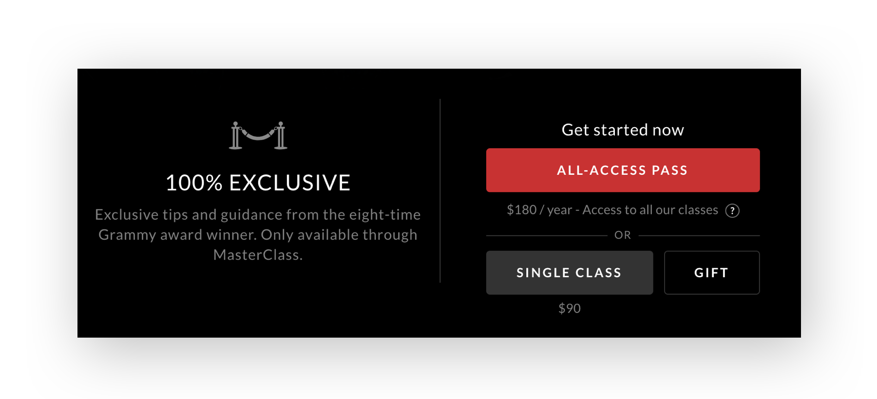
Masterclass does it wonderfully. They offer an All-You-Can-Eat feature for a fixed price (they have been iterating between a yearly subscription and a lifetime one). Users can still purchase only a single class if they want, but it´s a less predominant option.
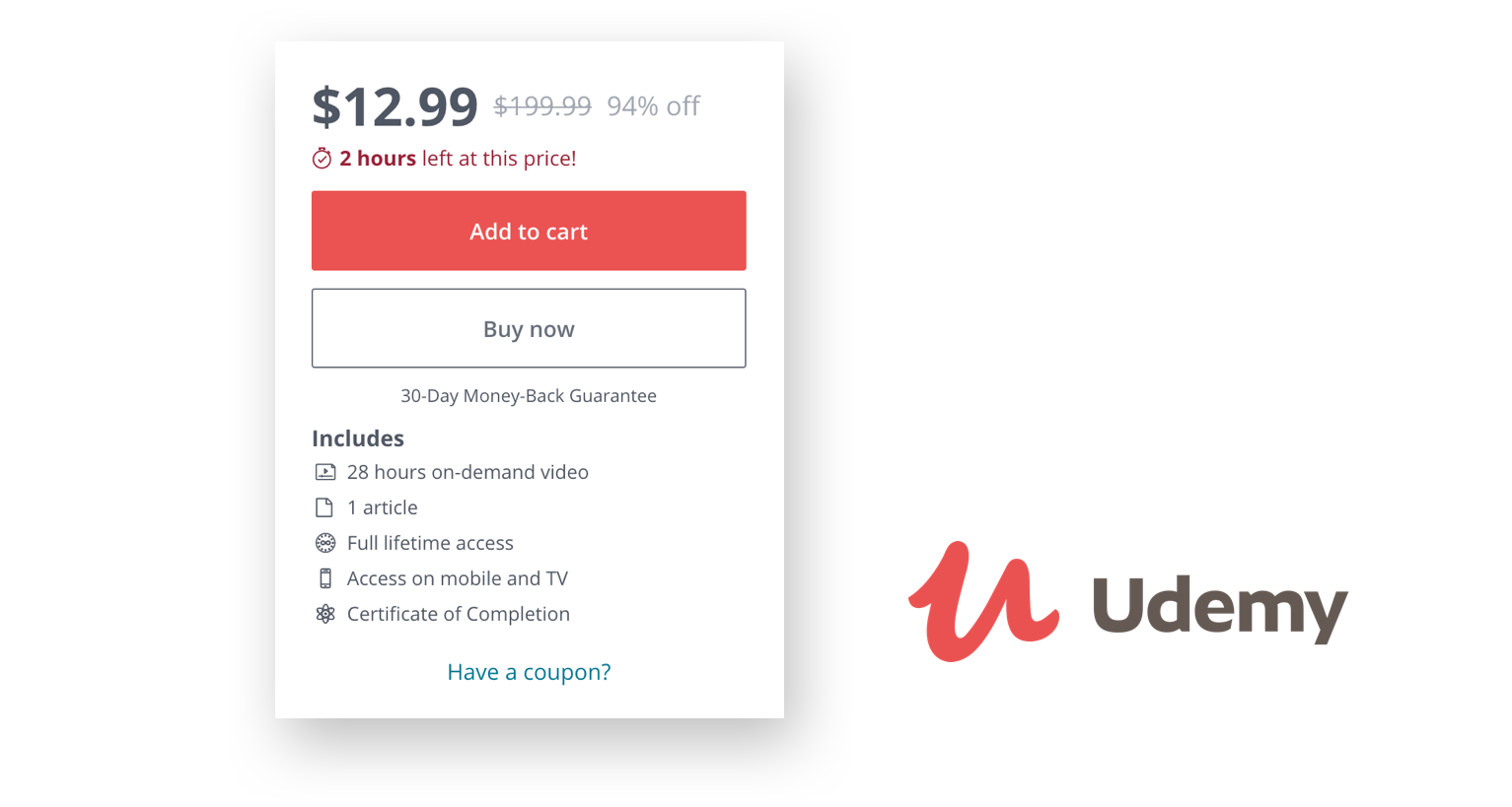
Udemy offers an Add to Cart option. Given their low prices and that many courses are very complementary to each other, they offer students the possibility to buy more than one course per purchase.
Now that we had all our potential alternatives, it was time to decide on what to launch.
To do so, I assessed different areas: revenue potential, feasibility, pros, cons, risks and dependencies.
Our agile mindset suggested to start small, so the alternatives of building something small before or after Checkout sounded attractive. Plus, we had some important dependencies if we wanted to launch an Add-To-Cart button or the All-You-Can-Eat feature: A refactor needed to be done before, which would take 5-6 weeks of work.
Below you can find a summary of the analysis carried out.
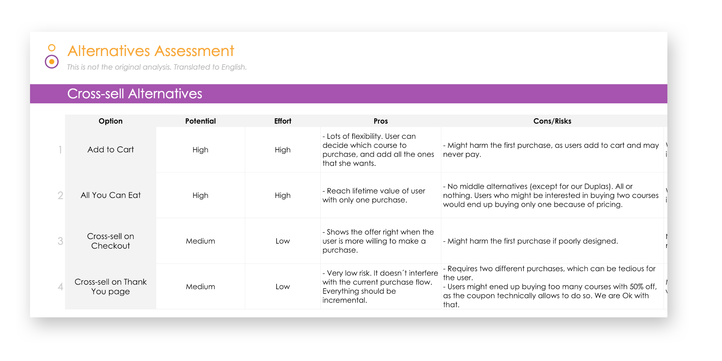
After carefully weighting revenue potential and risks, we decided to go for the upsell on the thank you page (option 4). Not only was that a low risk feature, but it also didn´t interfere with the current user flow. Everything would be incremental, and that would act as a baseline revenue benchmark for future decisions.

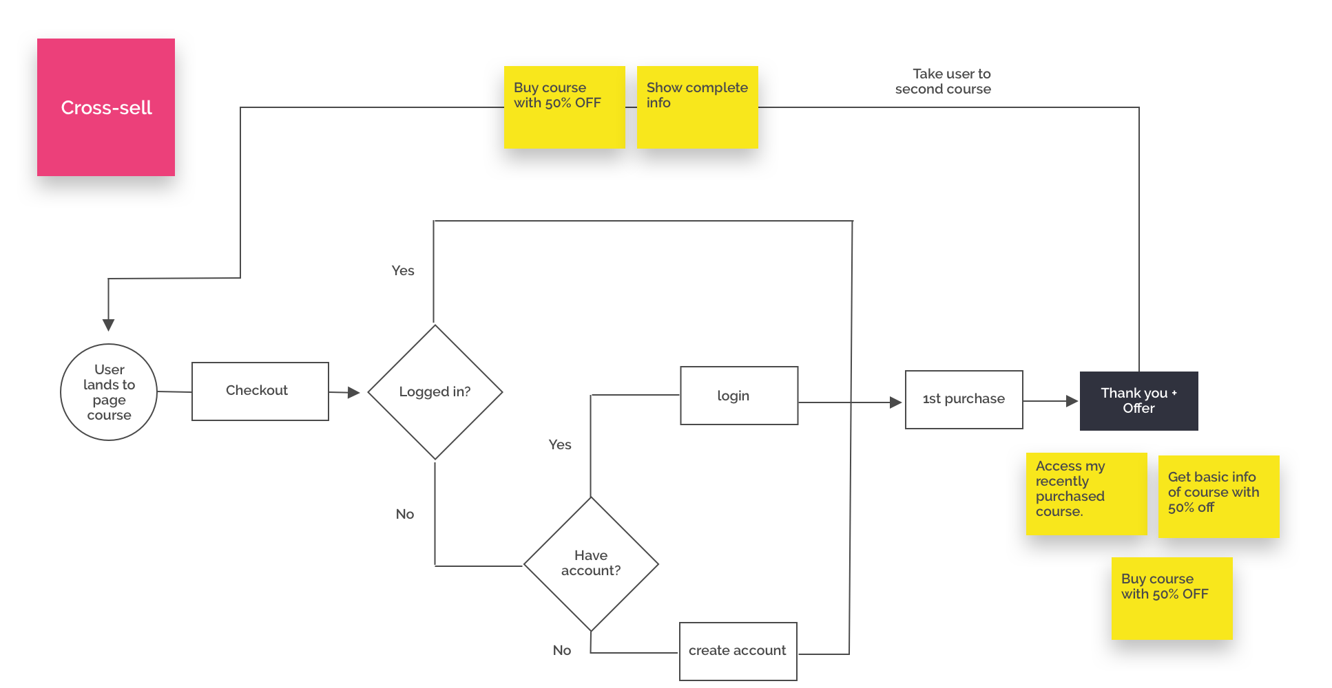
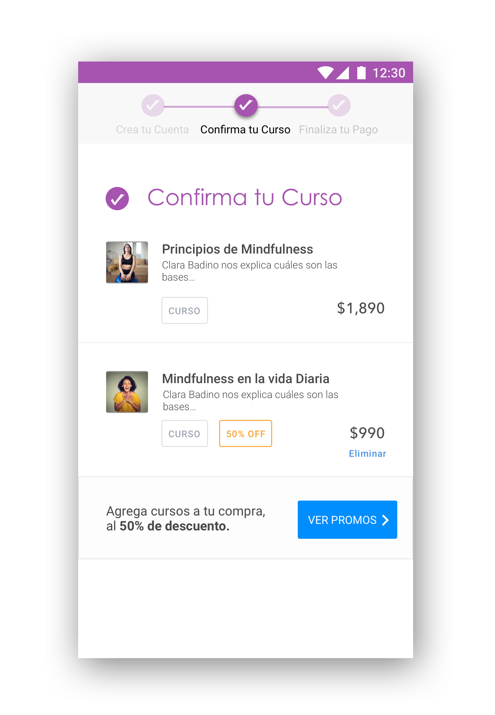
Once the decision to launch an upsell feature in the thank you page, I went on to architect the flow and information needed to make it happen. This was a critical part in the process before getting into visual design.
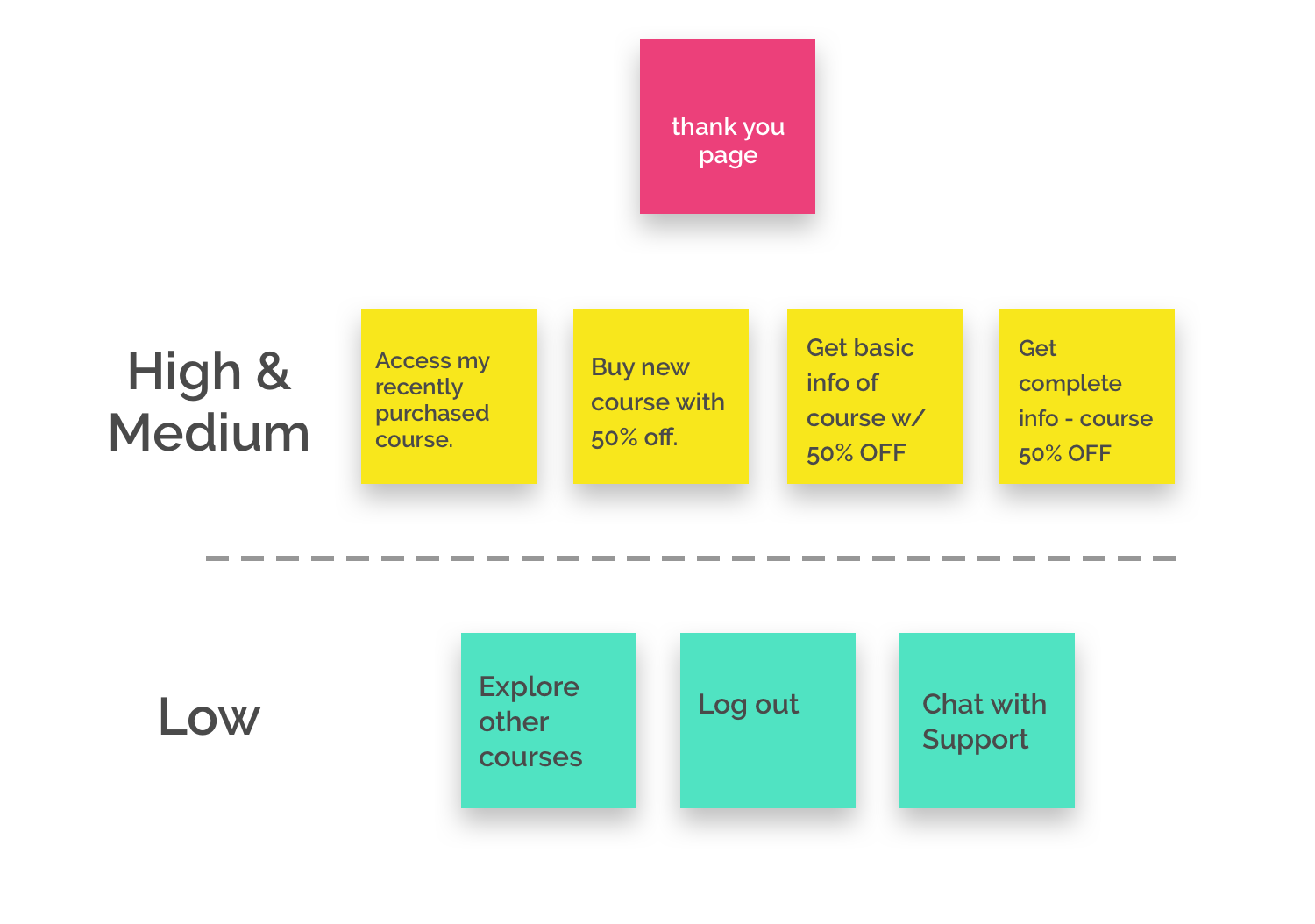
I compiled a list with all the important tasks that a user would like to perform. That would allow me to make sure I was including them all in the new proposed flow. This flow didn´t change significantly from the old one, but we needed to make sure that all the high-priority tasks were still covered.
I designed the complete flow for what would be a complete cross-sell (which naturally involves the first purchase). As said, given that we opted to launch a low-risk MVP, we tried to make as less changes as possible.
Having said this, I still needed to make sure that I was covering all the high-priority tasks users wanted to perform. With the flow laid out, it was much easier to define this and to spot potential flaws.
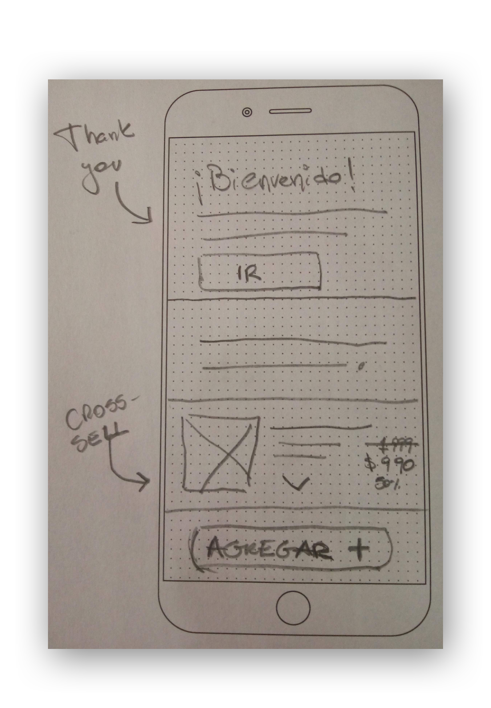
Once this was done, I went on to sketch my wireframes.
Having gone through this process allowed me to make sure I was covering all the high-priority tasks and to quickly detect potential flaws.
Wireframes were then sketched, keeping in mind the different tasks needed.
The final result shows two different areas: The "thank you for your purchase" section, where students could access their recently purchased course; and the "cross-sell" part. This hierarchy was preferred.
With the information architeture covered and wireframe sketched, I went on to put some color to our MVP!
With the wireframes sketched, it was pretty straightforward to launch our first iteration. But first, let´s take a look at our starting point.
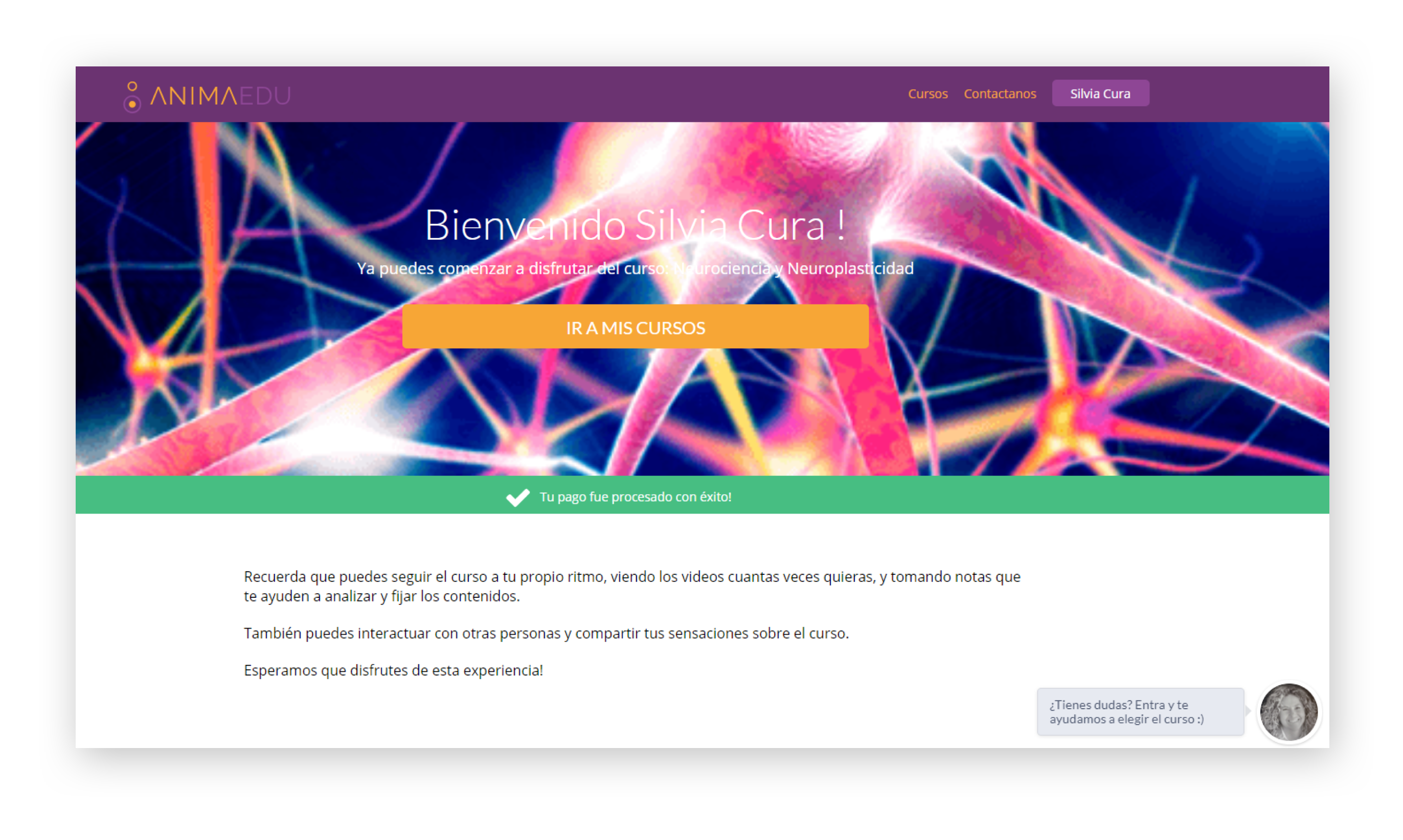
What you can see below was the old thank you page (desktop). As you can notice, apart from the opportunity itself, there was a huge room for improvement design-wise ;)
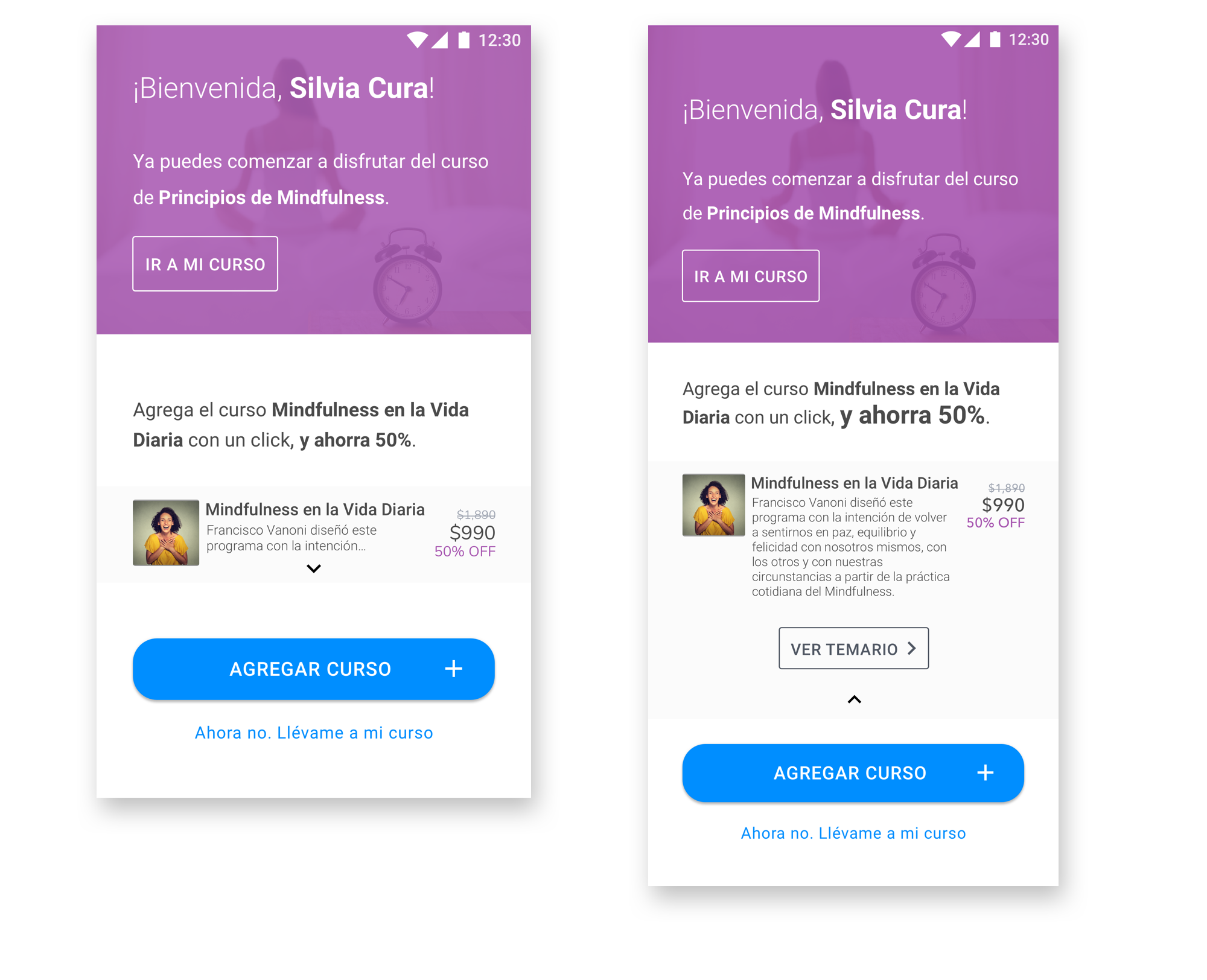
This is the first iteration on mobile. Some content and tasks were already there, but what was missing was the possibility to get some basic information about the course.
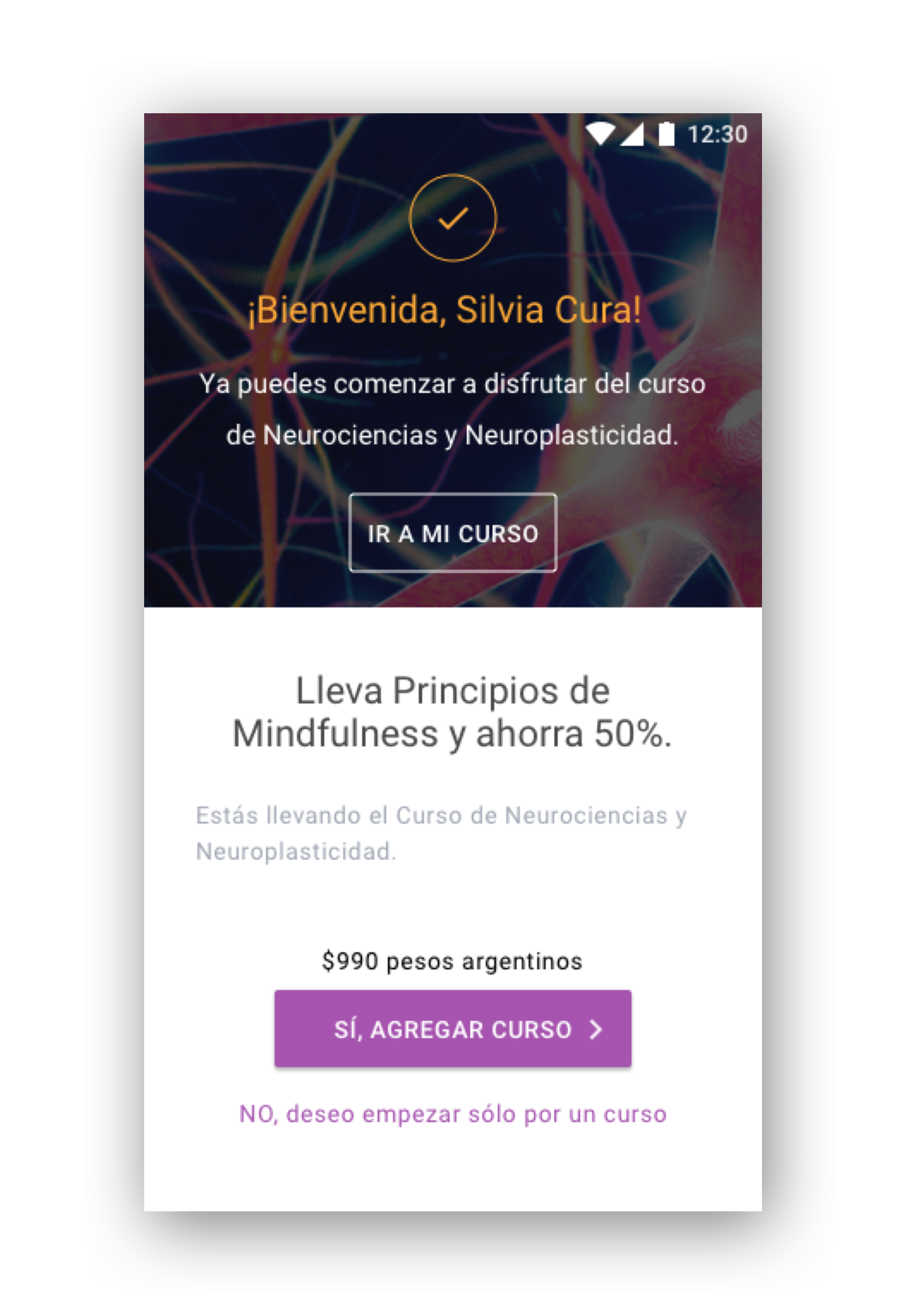
I finally created the following mobile version, with a drop-down option that would allow the user to get basic (yet important) information about the course. It ended up being a good use of space, as enough content is shown without getting too text-heavy.
Although we just launched an MVP, the impact was very visible right from the beginning. For us, it represented a very strong confirmation that user would love to buy more if we streamlined the buying process. We´re just halwfway there yet!
We have no plans to run any AB test in the near future for this feature, as the traffic reaching this page is low (only the users purchasing a course). However, we already have plans to dig more into addint more alternatives, especially the All-You-Can-Eat feature and the possibility to add another course in the Checkout page.
On your right you can find a sneak peak of the iterations I´m already doing.

In these 2 weeks of work, I had the opportunity to make a significant impact in revenue for AnimaEdu. But also, it was great to be able to provide users with a more seamless way to buy more courses. Some lessons and future work can be found below.