I designed the football app OneTwo end to end, from research to clickable high-fidelity prototype. OneTwo is a mobile app that allows football players to see their stats, videos, save and share. Note: This is a project delivered as part of my UX/UI apprenticeship at Bloc.

Football players (no matter whether they are amateur or professional) find a very hard time accessing the stats and videos of the games they play, and storing valuable content they see online.
As a result, their football experience is not complete, either because their individual performance on the pitch is lower than it could be, or because they struggle at saving and sharing exciting football content with peers.
OneTwo is a mobile app that allows football players to take full control of their football experience.
Whether players are looking to improve their performance by receiving meaningful stats and videos of the games they played, or whether they are amateur football players looking to save and share exciting football content, OneTwo will be there for them.
How could you build an app out of only one sentence from a client? I decided to invest time to research and have a better understanding about what I should be working on.
"We're really excited at the possibilities we see in the cloud storage and organization market (...) there's room for another player if we can find the right combination of features to meet the needs of a particular audience".
That was all. Naturally, the first thing I needed to do is to clearly define what the problem we wanted to solve for was and what the available resources were. A list of potential problems to be solved was compiled in order to have a basic structure to start off, and also a list of questions to be answered along the way.
Given that the client was open to target specific niches and given that I know the football market quite well, a decision was made to shift the research towards understanding whether the football market (coaches and players) would be in need of a storage solution.
“There is an opportunity to build a storage solution tailor made for football players”. This was my initial hypothesis.
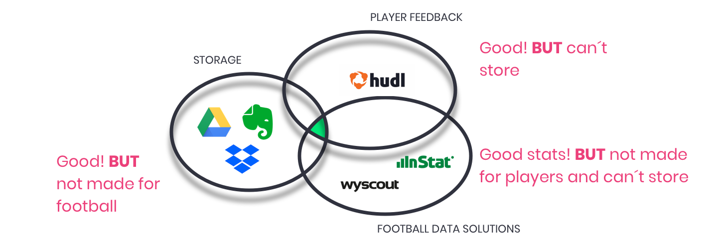
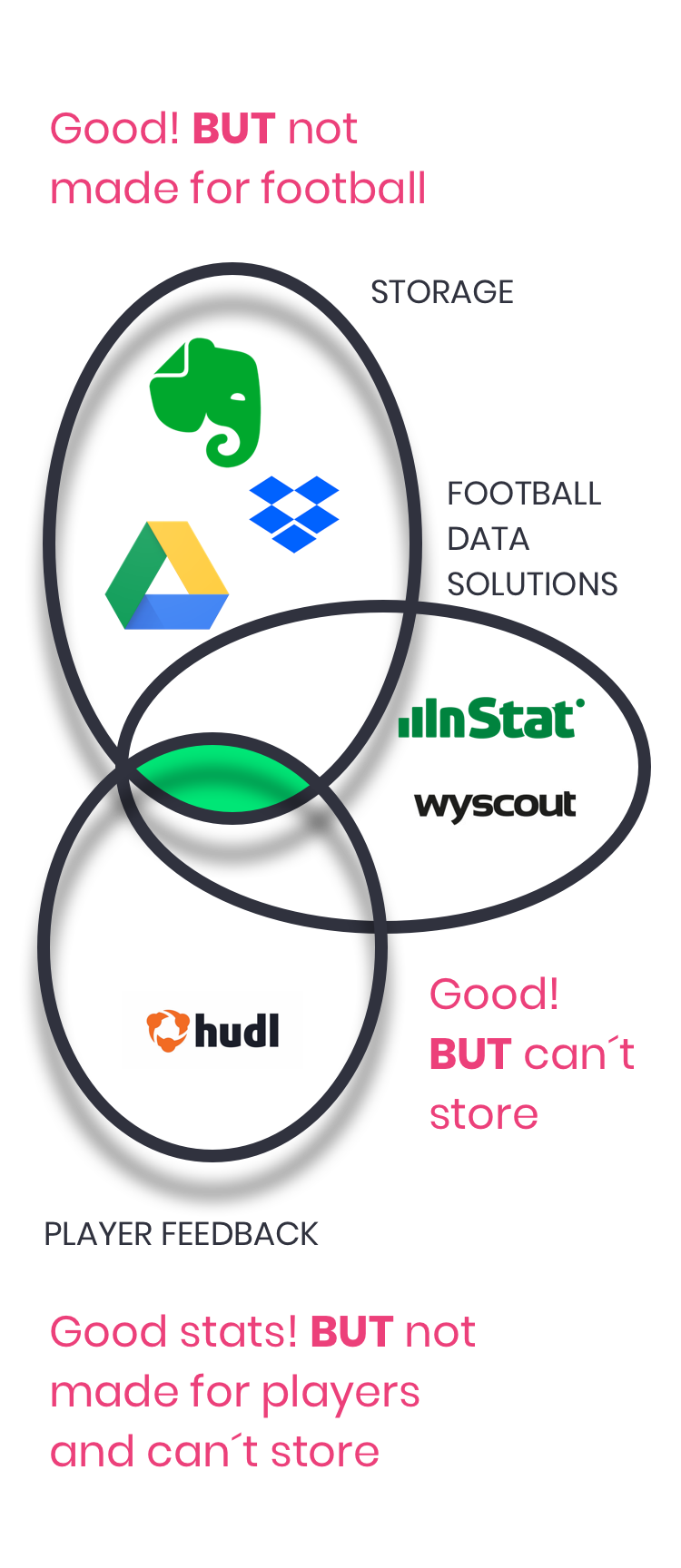
Next, I carried out a competitive analysis focusing on Google Drive, Dropbox and Evernote (which are primarily storage apps), but also looking at Wyscout and Instat Scout, which are football platforms that provide stats and videos to Coaches.
I also looked at how these apps where structured along three tasks: uploading files, organizing file and sharing files.
Based on the competitve analysis, no app had storage, data and player feedback functionalities, all at the same time.
The survey targeted football players and coaches to understand better and/or validate:
This was a critical stage because it would help me take the decision on whether to continue this direction (or not) and, if so, it would theoretically give me very valuable insights around what users value.
In just 24 hours I received 146 respondents (39 football players and 107 Coaches or members of Coaching Staff), enough to proceed with analysing the feedback.
With these valuable insights, I was able to create four User Personas. Clearly there were different types of users, with clearly different needs (yet some overlapping). These user personas played an important role in identifying what the needs and frustrations are, as well as what things they value the most. Some would value storing and organizing, some others would find valuable to get football performance data right away on their devices.

“I enjoy working with the next stars a lot. I hope to become a star in the future too.”
Key Paint Point
- The football products he uses don´t talk to each other. Everything needs to be done manually.
“Football is my life. I need to make an excellent season and move to Europe.”
Key Paint Point
- Some Coaches may not provide him with the videos and stats he needs. He is too lazy to look for that.

“Every Saturday, I play in a tournaments with friends. I love every single moment of that day”
Key Paint Point
- He can´t organize the material everyone sends through Whatsapp (for example, in tags or categories) and that content (which is vualuable for the team) gets lost.

“My dream is to become a professional football player. Hard work is key. I will save my family!”
Key Paint Point
- He can´t organize the material his Coach sends. He doesn´t know where to store it and he doesn´t have time to think through that problem.
So far, I had been able to:
With all this information, I would move on to structuring the information and ending up with the first wireframes.

I started by creating User Stories for all the different User Personas. For every high-priority task I then created flows which would allow me to design the sketches needed to get to the first wireframes (and test!).
User Stories were written down. A list of ~20 tasks for each user persona was carried out. After that, User Flows were created for all the 11 high-priority tasks. That allowed me to envision the journey I was going to take users through, as well as the different options that I would be surfacing to them.
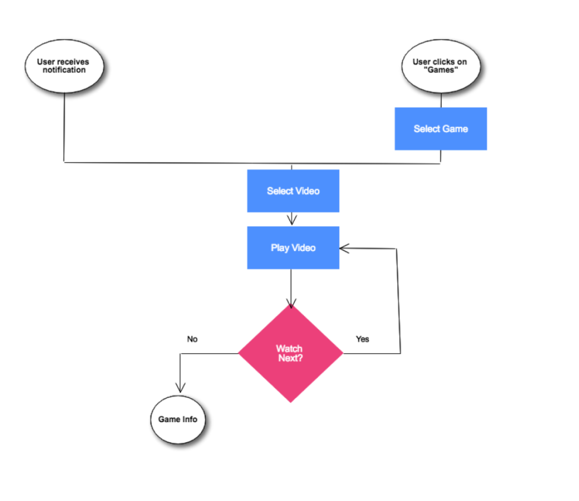
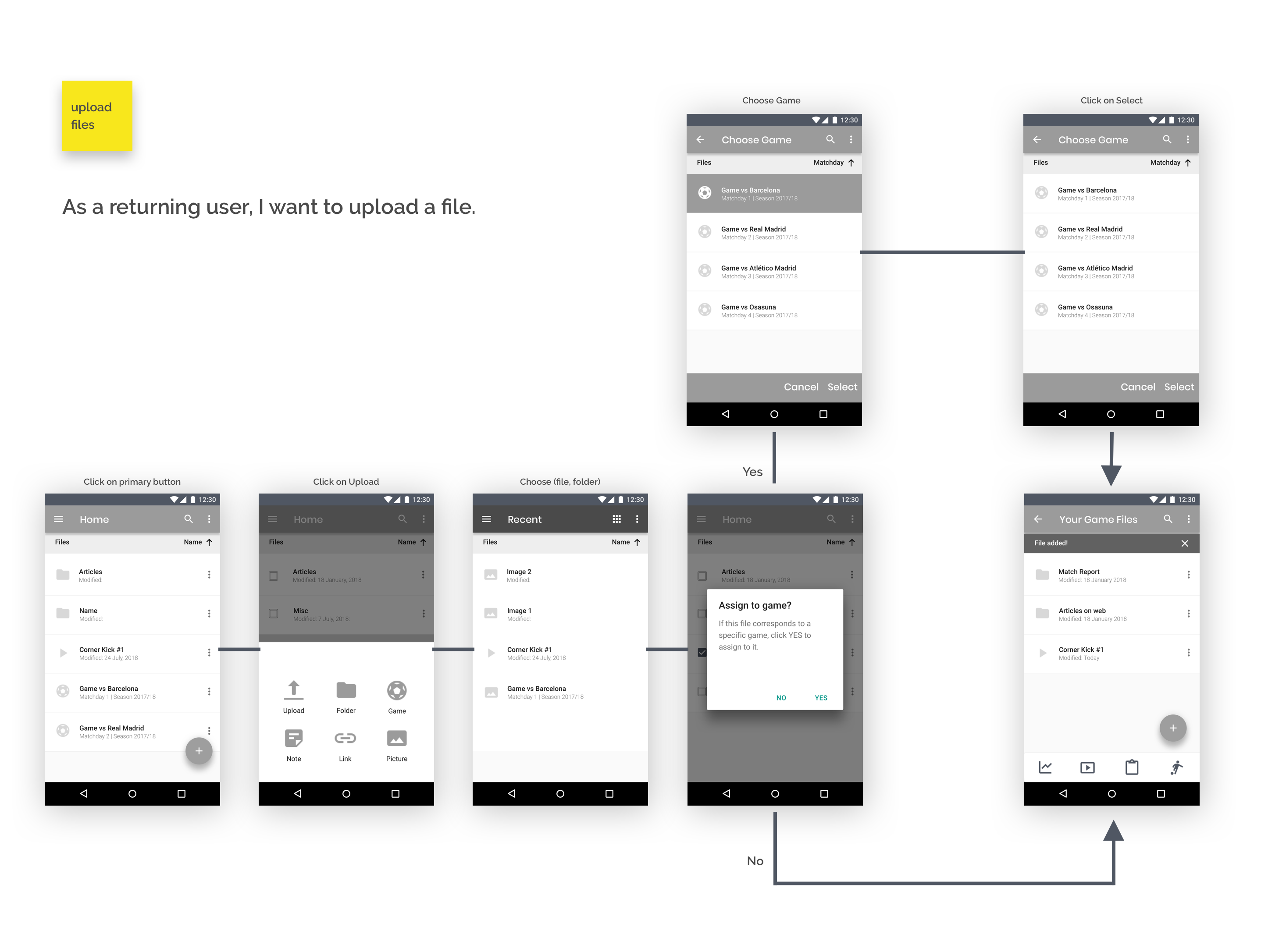
For each of the high-priority tasks (in yellow), I designed the journey I was going to take the user through. In some cases, I also added some medium-priority tasks.
This example is for the task “I want to upload a file”.

Wireframes were then built. It was an iterative process trying to find different ways of providing optimized journeys for the users.
11 different high-priority flows were sketched and digitalized for further testing. With all this, I was able to run my first Usability Tests, which helped me to optimize flow before creating the hi-fi mockups.
Wireframes for the high-priority user flows were sketched and then digitalized for further testing.
The process started by understanding the top tasks users would like to achieve, the journey was then designed and sketched... Now, I needed to validate if it was intuitive enough.
So before moving onto the Visual Design stage, I ran a Usability Test, testing three of the high-priority tasks: signing up, uploading a file and organizing a file.
The three tasks were conducted successfully in a timely manner by all the users. No major roadblocks were found, except for the task of organizing a file. This allowed me to make the necessary corrections way in advance!
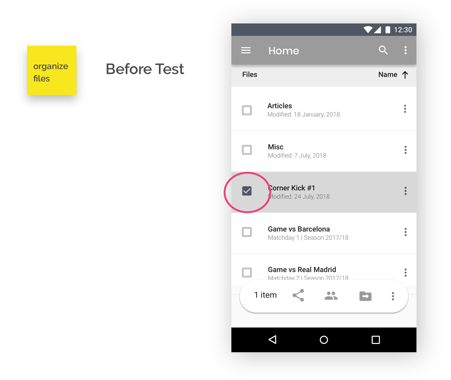
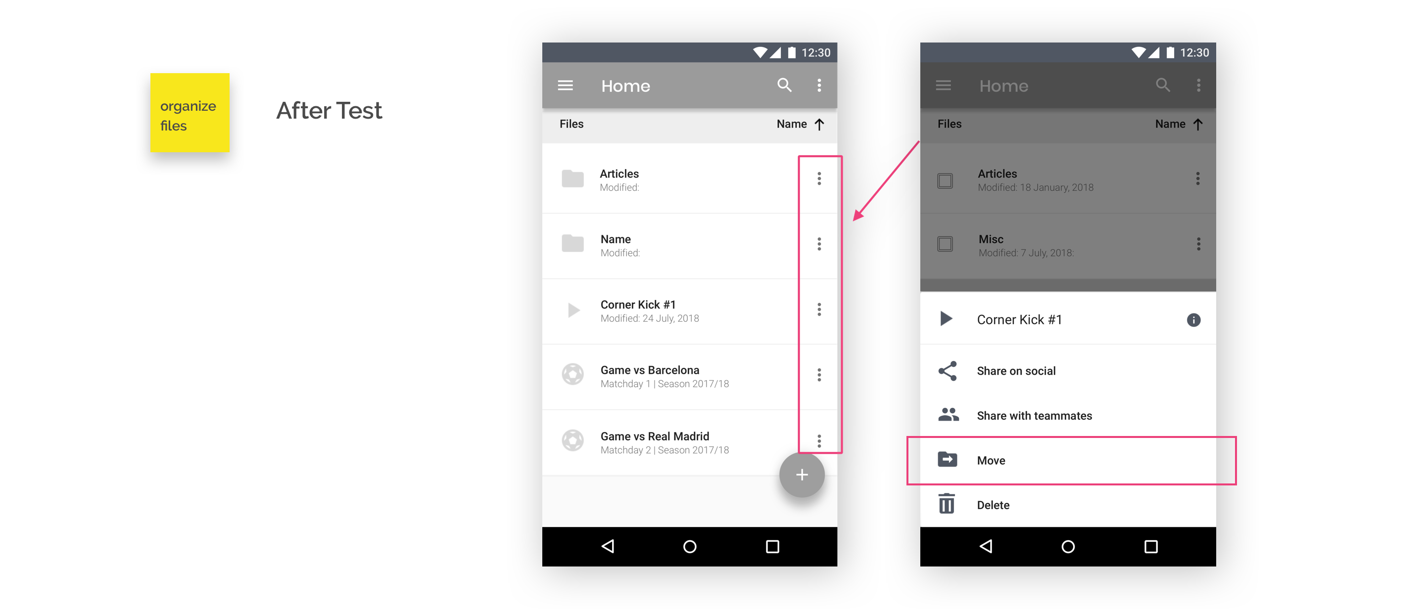
When trying to organize a file, user would tend to click on this “See More” option (see below, in red). By that time, there wasn´t an Organize/Move file option in this menu, so I added it. The only option was to click on the left side of the file, clearly not optimized for mobile.
After making the appropriate changes, the task of organizing a file became much more seamless to perform.
From an information architecture point of view, the biggest challenge was to define what a Game is. Unlike traditional storage app, where one could have essentially folders, files and tags, the concept of Game also arises.
The definition adopted for “Game” was the following:
- A Game is an element different from a folder, a file or a tag.
- A Game acts as a folder in the sense that it can store other files (or folders) and that it can be associated with tags. But also a Game can contain stats and performance information coming from a data provider.
- A Game can also have “Season” and “Matchday” as attributes.

A Game

A Folder

A Tag

A File
So far, I had been able to:
With all this information, I was ready to move to the Visual Design stage, which would allow me to communicate and generate the appropriate concepts and emotions.
I had critical feedback by users which helped me validate the hypothesis; I defined the tasks, the journey, sketched the core functionality and tested it. Now it was time to create the visuals.
The branding phase was a big process in itself, involving but not limited to the following:
How could I convey, through an appropriate use of fontypes, colors, images and communication, a significant set of emotions desired by a broad audience, ranging from purely football fans looking to have fun or store feelings, to professional players, who might take it more seriously and who would be simply looking to perform better? Definitely not easy :)
How could I convey, through an appropriate use of fontypes, colors, images and communication, a significant set of emotions desired by a broad audience, ranging from purely football fans to professional players?
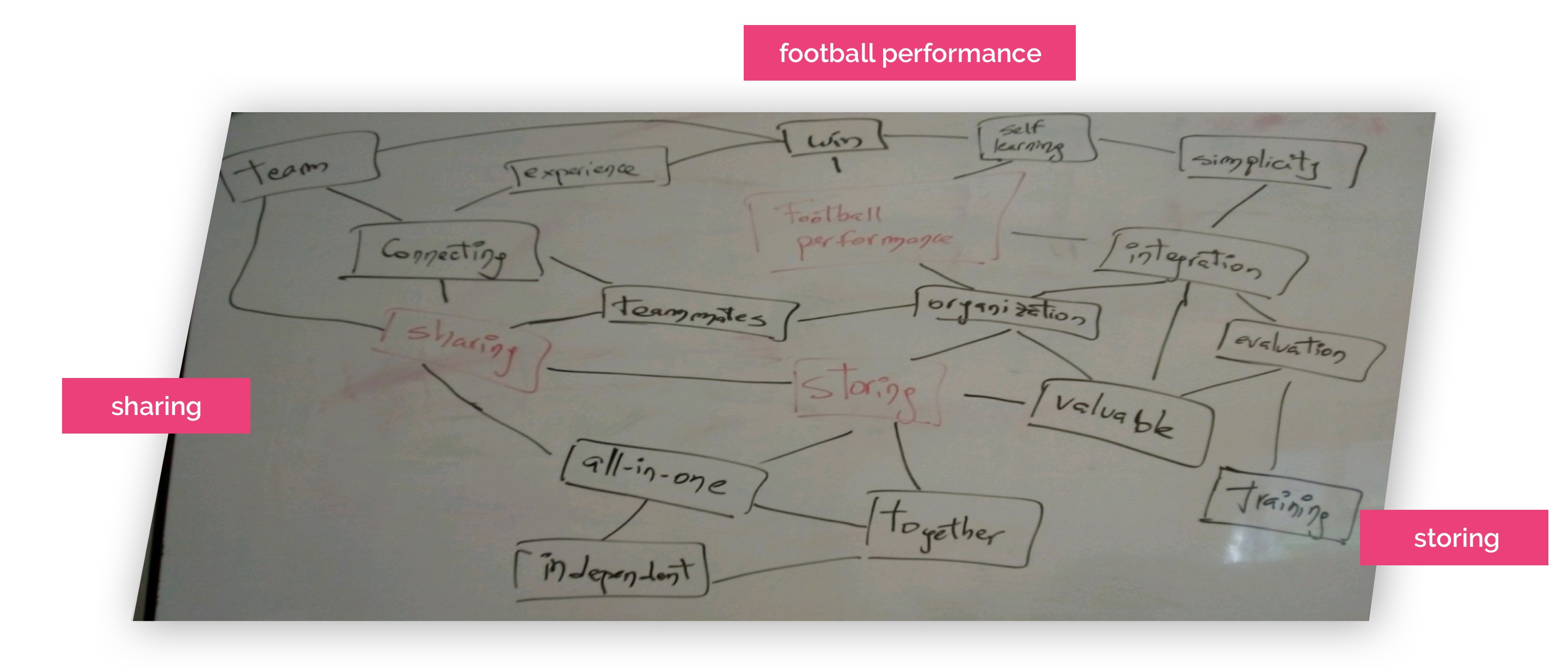
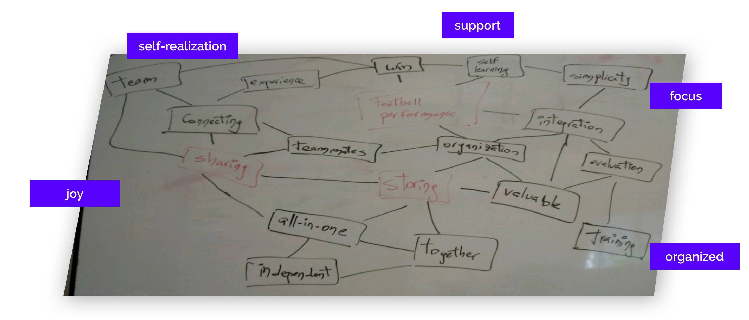
The following mind-mapping was carried out in order to start tying ideas together. Three concepts were taken into account to start. The app should have: (a) The integration of Hudl in order to be able to get each player´s videos and help them perform better; (b) The capacity to store that Google Drive has; (c) The ability to share in a seamless way in order to maximize any football-fan experience.
Also, two strong candidates for the name of the product were discovered: “Dito” (meaning “control” in Latin) and “One-Two”. OneTwo was chosen. “One-two” is a football concept. It is the action when one player has at least one opponent in front of him, and in order to “eliminate” this/these opponent(s), he passes the ball to another player and runs forward to receive the pass from his teammate (but now far from his opponent). “One-two” represents quite precisely the spirit of the app and finally chosen as the name of the solution. OneTwo is made for individuals, but it gets more powerful when shared with the team.
With the concepts I wanted to create the solution around and with the feelings I wanted to convey, now was time to start putting together the colors and the elements that could appropriately represent what I wanted to create. Thus, I created a moodboard in InVision.
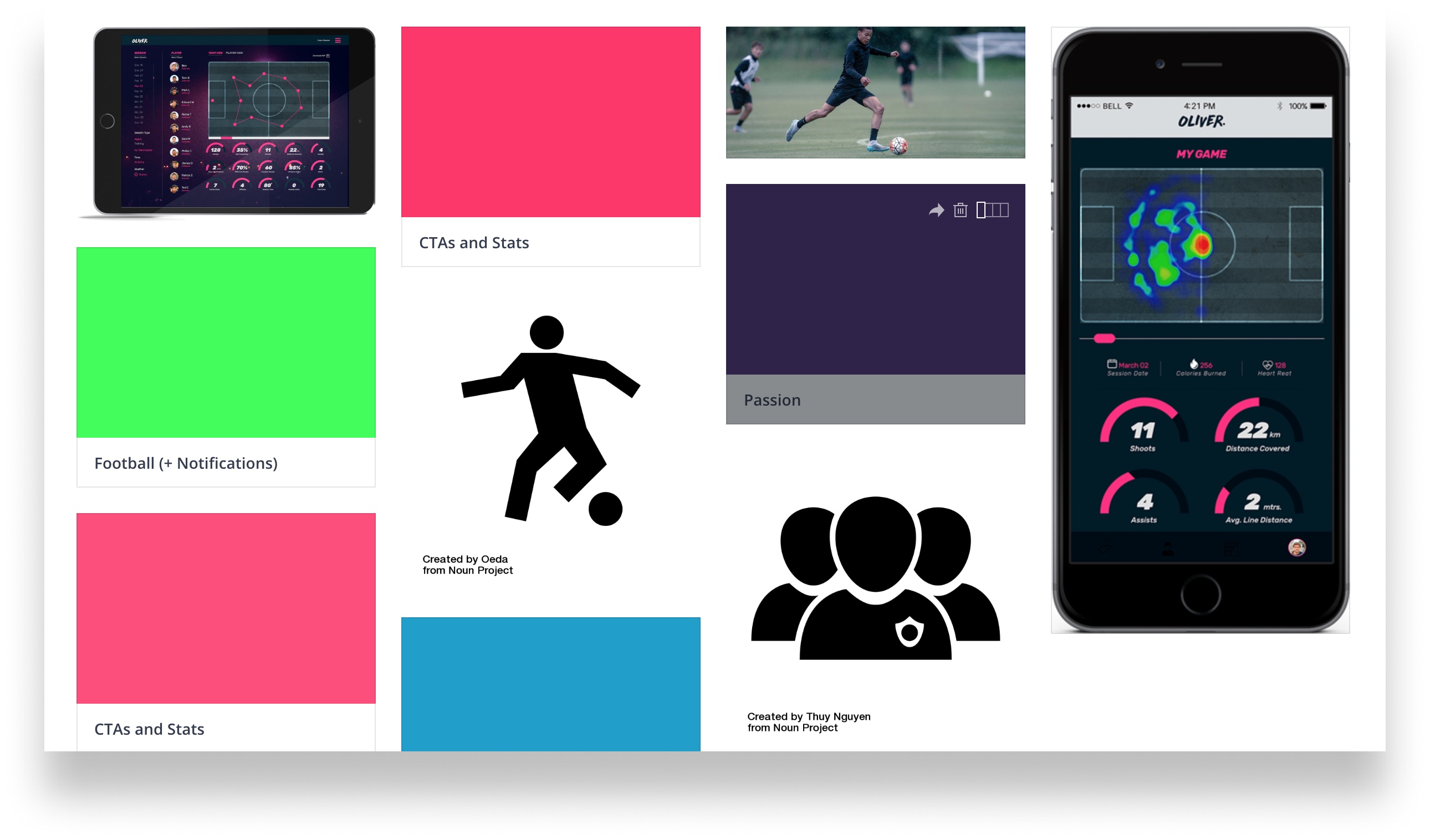
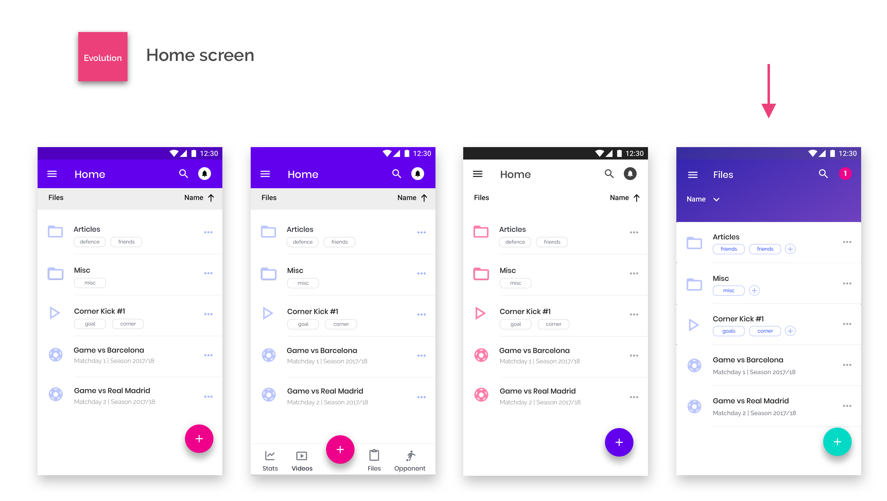
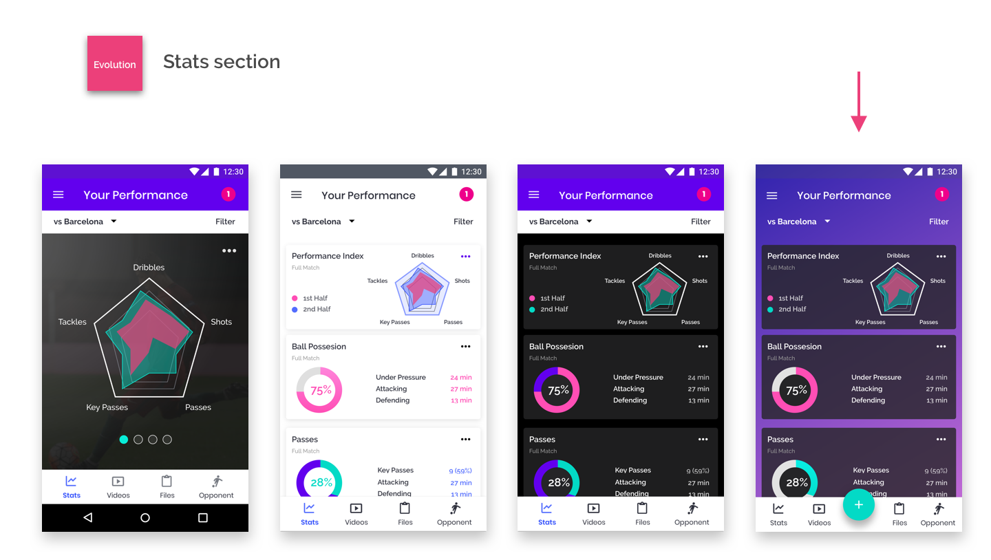
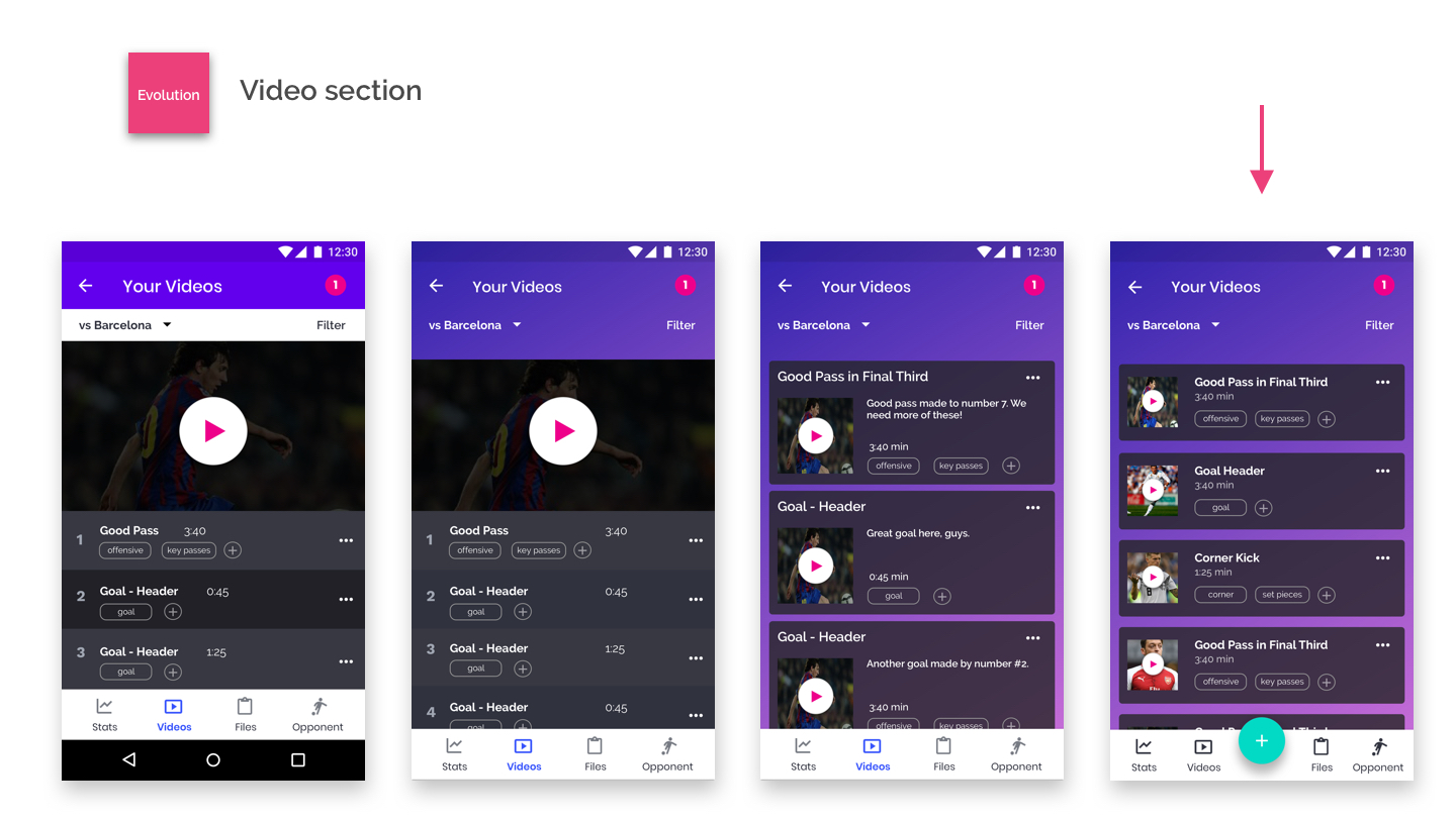
A lot of iteration has been made throughout the process: The reason for that was to try to achieve in a more precise way the branding goals. A summary of the evolution can be found in the following images:
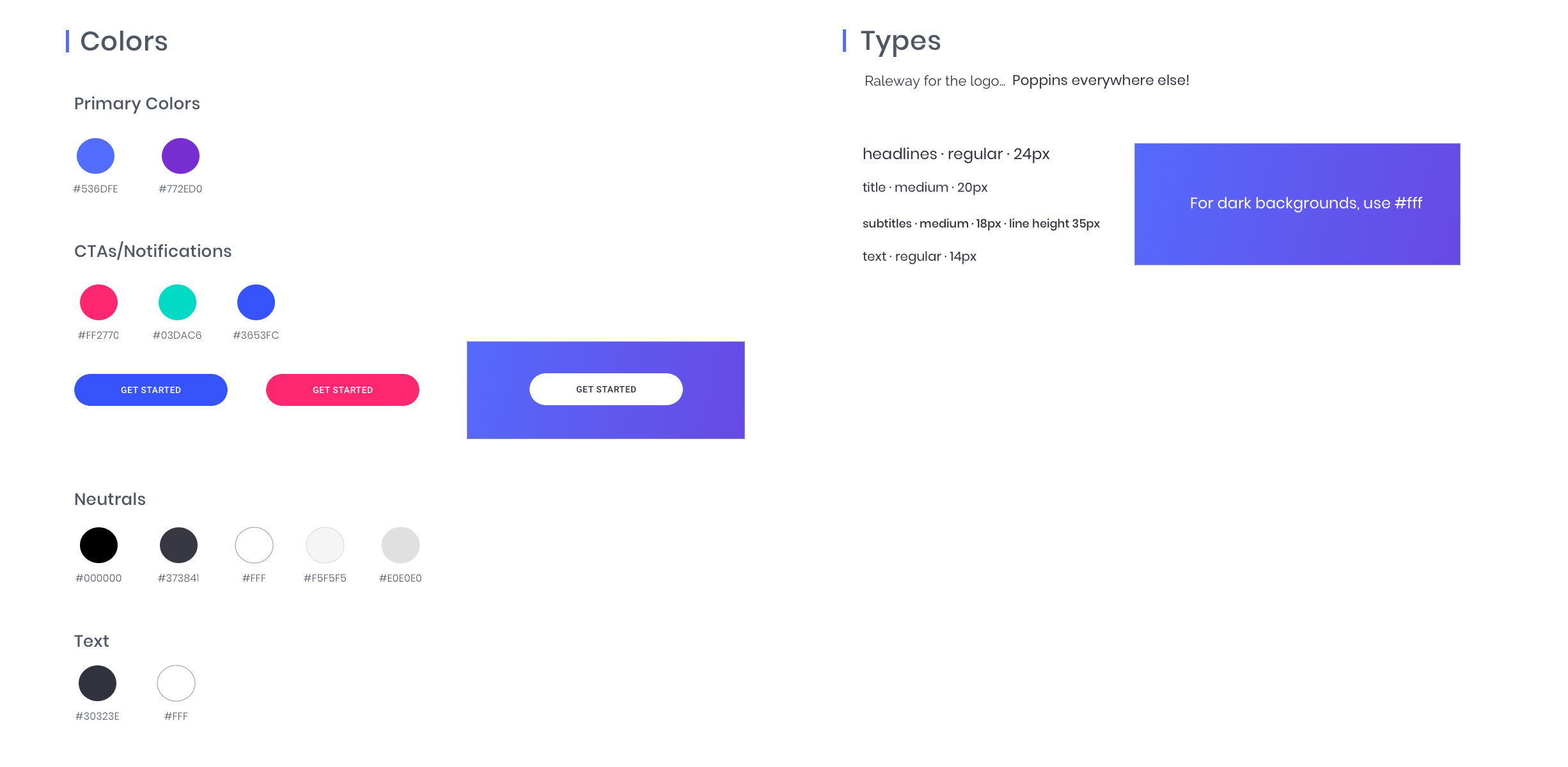
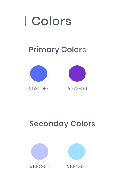
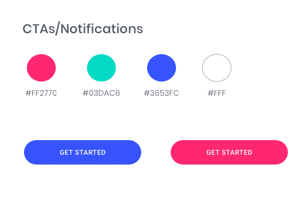
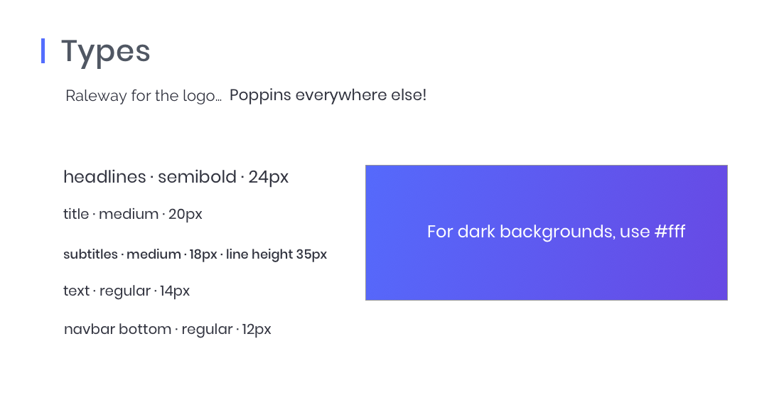
After all this thorough process, I was able to put together a Style Guide, which would help me turn my wireframes into live, high-fidelity mockups. Also, I could maintain a high level of consistency across screens, something quite difficult to achieve, given that the app had two very different sections (storage and performance.). Here is a link to the full style guide.
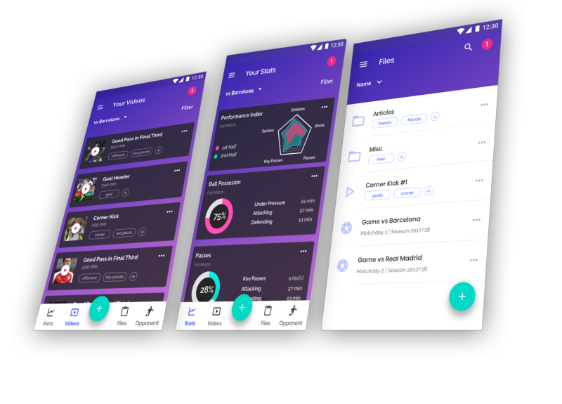
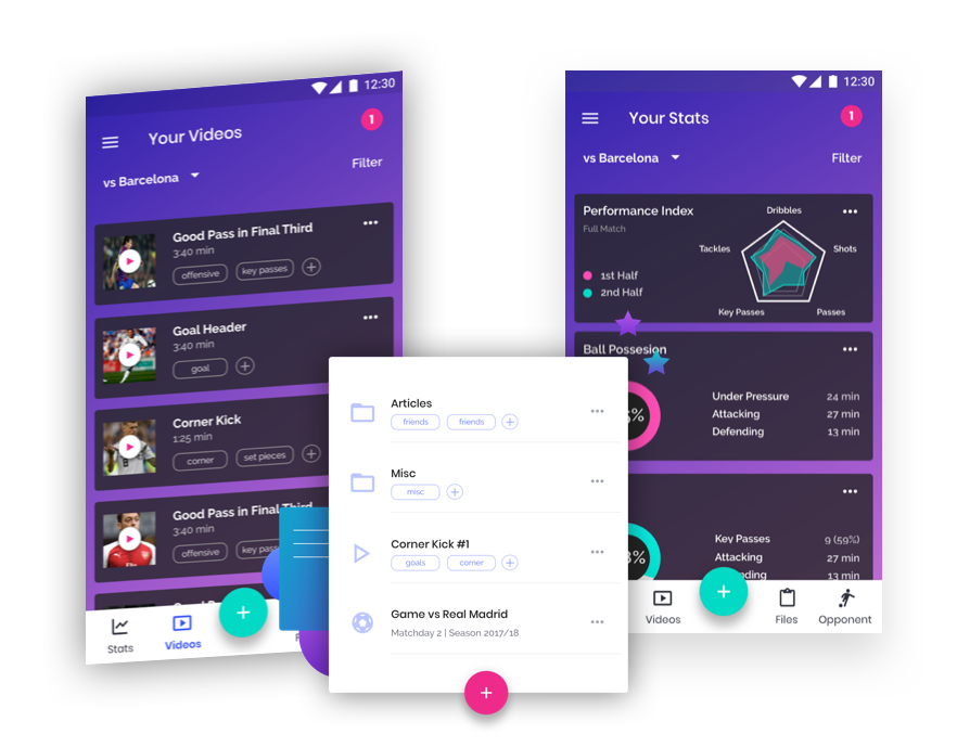
With all the research done, the wireframes tested and validated and the core elements for the app branding defined and decided, I was able to finally create high fidelity mockups and a clickable prototype.
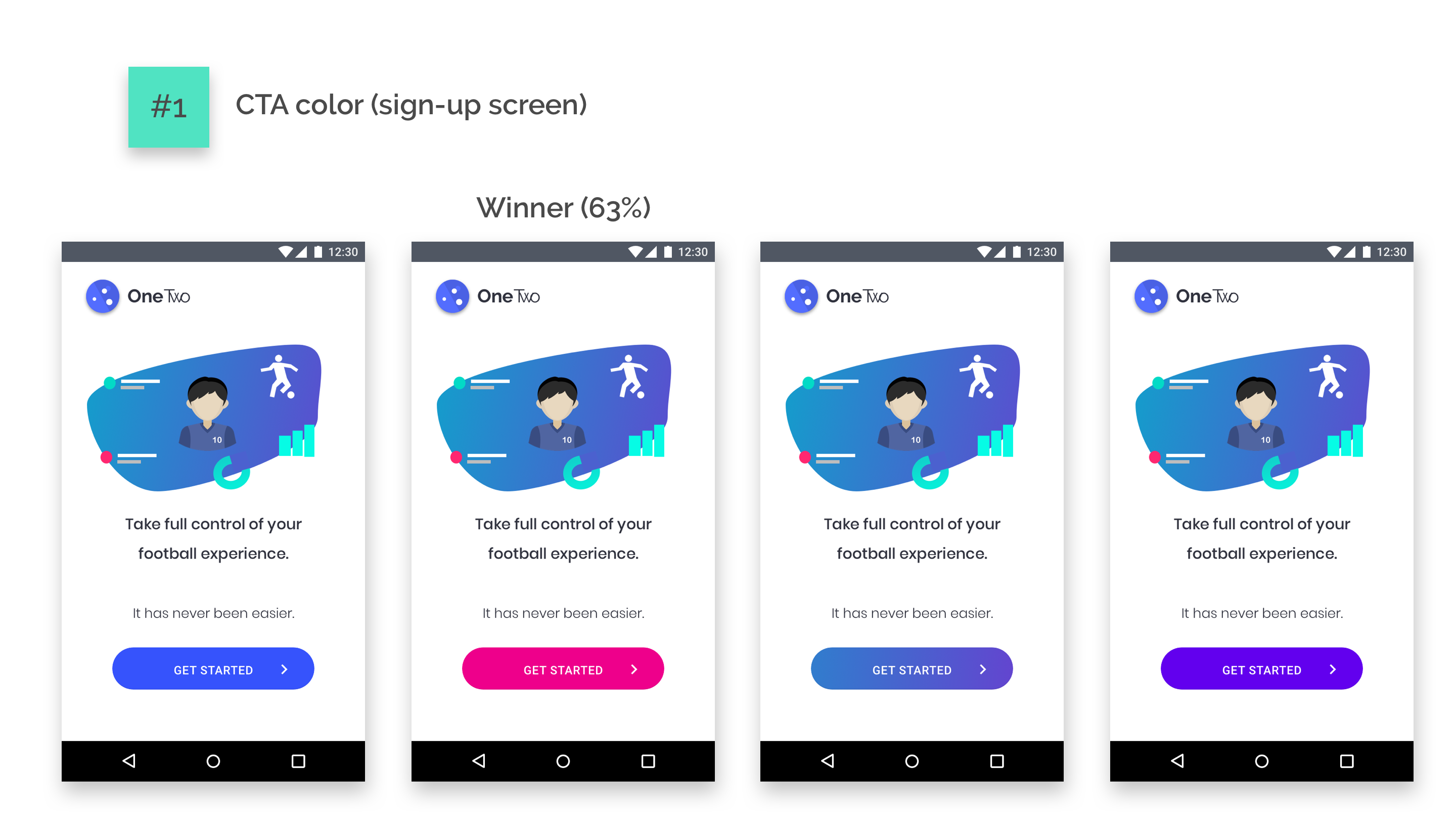
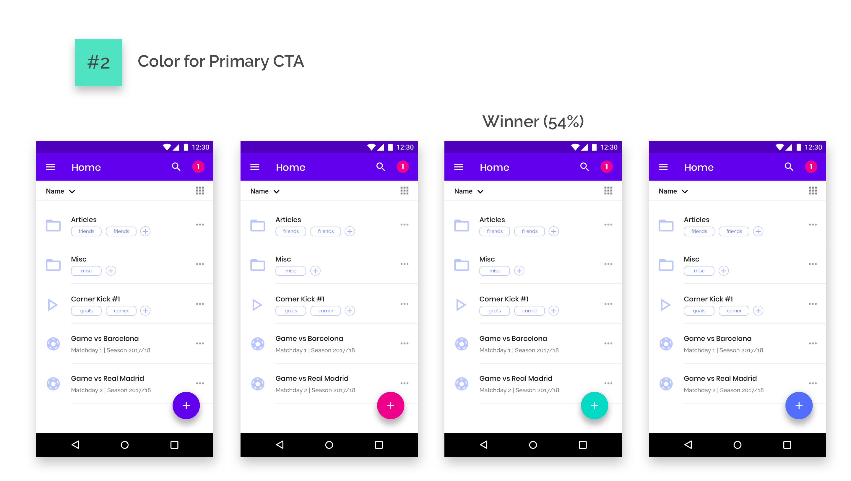
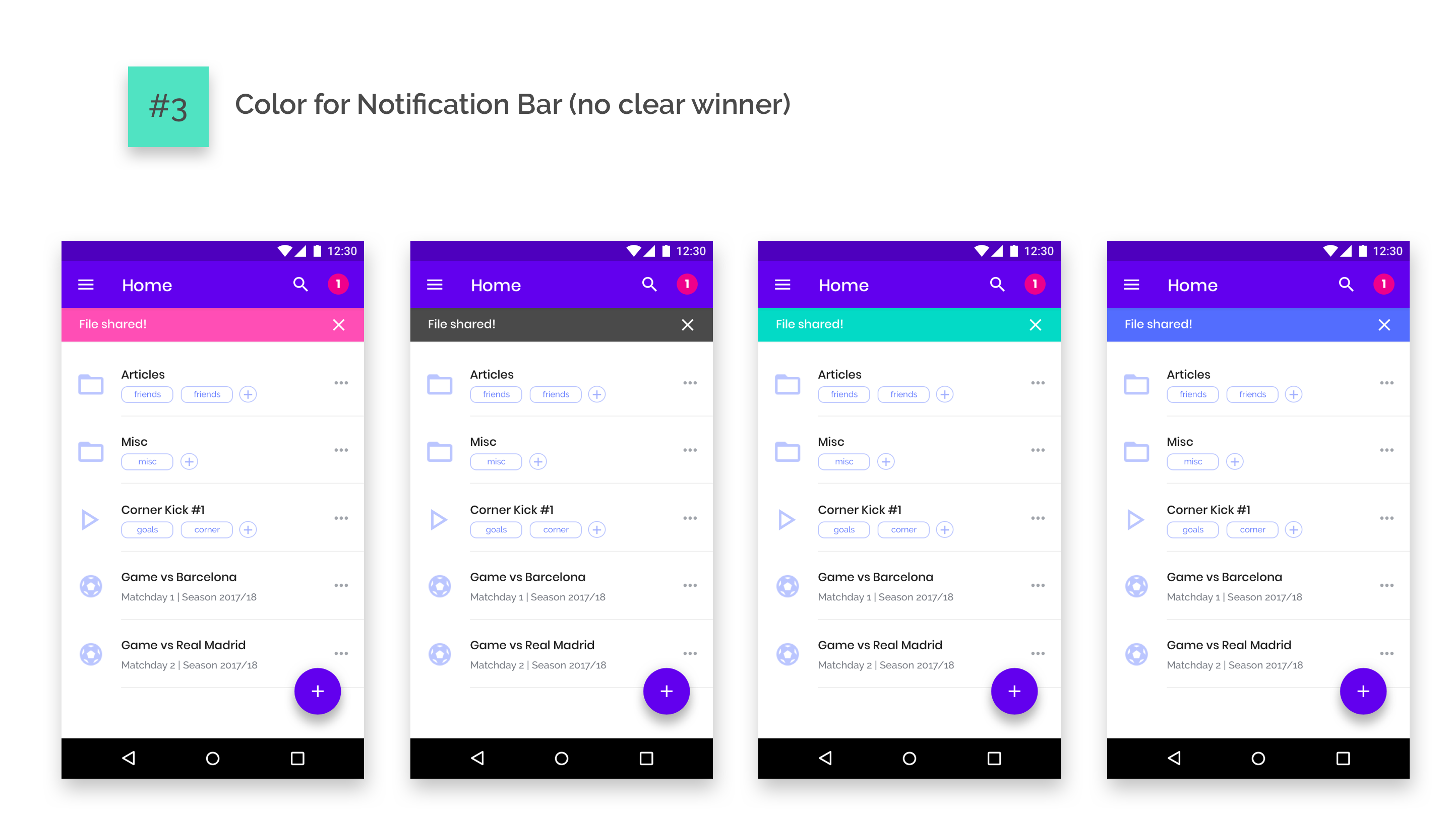
Throughout the process I made different iterations, some of them being tested afterwards through preference tests.
A couple of preference tests were carried out, which informed about which combination of colors might be preferred by users. More can be done on this front as well if more time/resources can be allocated.
After that, tests were carried out testing three more high-priority tasks. The three tasks were ran successfully in a timely manner by the three users, sometimes following different paths. No major roadblocks have been found, even when tasks were ran by two heavy iOS users (the app is optimized for Android).
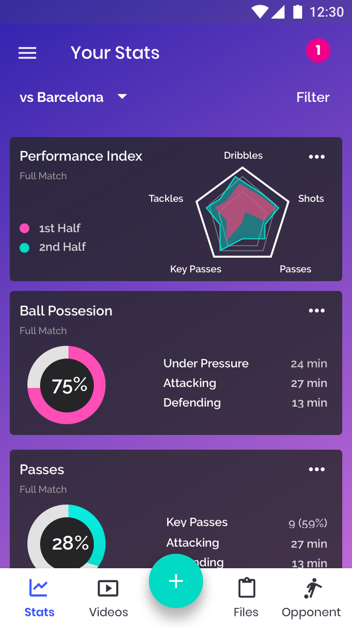
Task #1 (see stats from a Game vs Barcelona) took the least time given that a link to that game was already in the homepage. But when users were asked to get to the stats using an alternative way, they also found it fast (except for one user, who had a hard time understanding where the hamburger menu was).
Task #2 (upload a file and assign it to game vs Barcelona) was also ran successfully. Interestingly, users followed different pathways. Two started by first uploading a file and then assign it to the game and one of them first went to the game and uploaded it from there. The ability to provide user both alternatives should be kept.
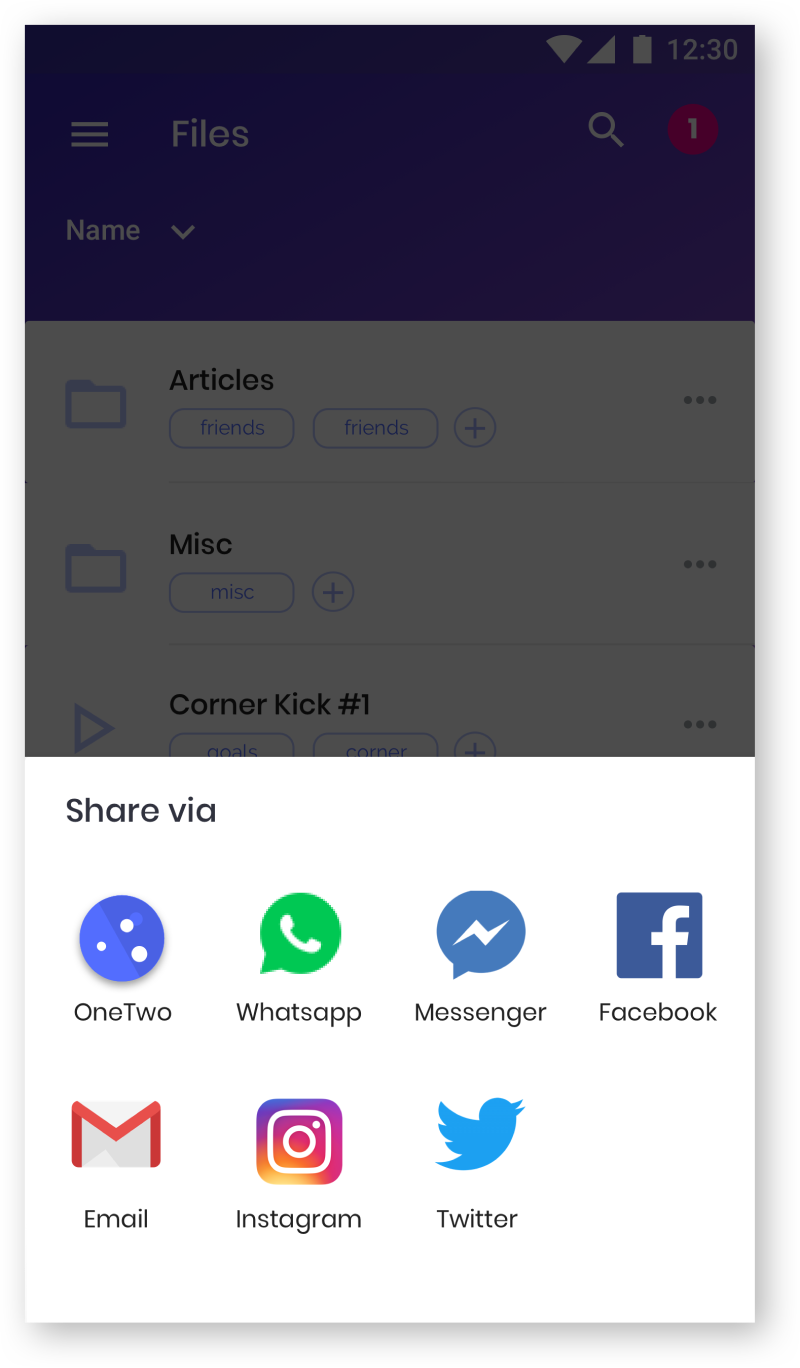
Task #3 (“share a file with a person called Amanda González”) was also ran successfully, although 100% of the users asked whether Amanda González was a teammate or someone in social (which are two separate options in the app). There was an opportunity to optimize the process by merging both options into one (e.g. “Share”) and/or by improving the wording (e.g. instead of saying “share with teammates” to say “share internally”, “share via OneTwo”, etc).

In these 3 months of work, I had the opportunity to embark on one of the biggest digital challenges I had so far. OneTwo ended up becoming an app that solves clearly defined problems (performance stats and storage for football players), but it hasn´t been easy to get there. In particular, some of the key lessons and further work are the following: